The Challenge
VennCap Real Estate is a boutique specialist investment firm established in 2009, representing and advising local and international investors across Australia and New Zealand. Despite managing nearly a billion dollars in assets, their digital presence hadn't kept pace with the scale and credibility of the business.
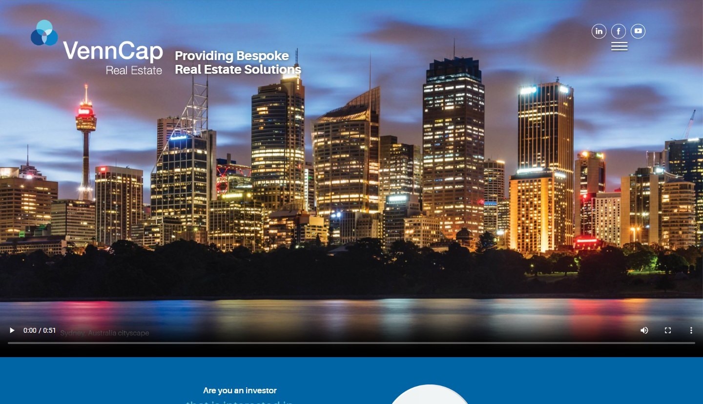
The old site — built on a basic template with a blue colour scheme and generic stock imagery — gave no indication of the firm's expertise or track record. Investors and partners visiting the site had no intuitive way to access case studies, team credentials, or upcoming tenancy opportunities.
Approach
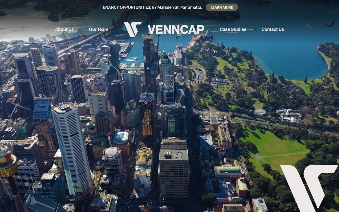
The rebrand started with a full visual identity reset. Out went the old venn-diagram logo. In came a bold, geometric V-mark — clean, precise, and commanding — paired with a dark editorial palette of near-black and warm neutrals. The new brand language reads investment-grade: authoritative without being cold.
The website was then rebuilt ground-up in Webflow, with the brand system baked in at every touchpoint. The architecture was rethought to surface three core user journeys:
- Investors looking to explore the portfolio and track record
- Tenancy seekers browsing active leasing opportunities
- Partners & advisors wanting to understand the team and approach
What Was Built
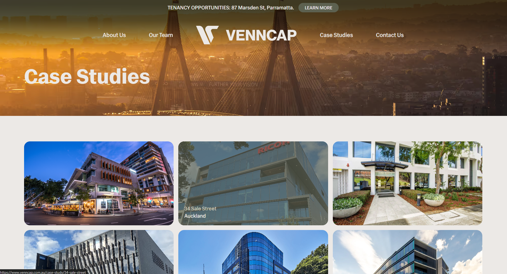
The site features rich case study pages for each managed property, interactive team profiles with expandable bios, and a dedicated tenancy opportunities section. All imagery uses real aerial and architectural photography — no stock photos.
The entire experience is fully responsive, with a streamlined mobile layout that makes it easy for investors to access key information on any device.
Outcome
The new VennCap brand and website positioned the firm at a level that matches their actual market standing. The brand guide ensures consistency across digital and print touchpoints — including pitch decks, proposals, and signage — so every client interaction reinforces the same premium identity.