Three Years On
In 2023 I rebuilt Speedcubing Australia's website from a grey page of links into a proper Webflow site, with a competition map, a records database and a CMS the volunteer committee could run themselves. You can read about that build in the 2023 case study.
By 2026 the site had done its job, but it was showing its age. SCA also had a refreshed brand on the way. So, as SCA's Website Coordinator, I redesigned and rebuilt it.
The Brief
The goals came straight from three years of watching how people used the site:
- Help newcomers. A big share of visitors have never been to a competition. Parents, schools and venues land on the site from Google wanting to know what speedcubing even is.
- Make records feel like news. National records are the most exciting thing in Australian cubing, and the site should treat them that way.
- Look like the new brand, without losing what people liked about the old site.
A Refreshed Brand
The redesign is built on a brand refresh by Hong Kong based designer Julienne Pancho. My job was turning it into a design system that would hold together across every page in Webflow.
The palette still comes from the cube itself: green and yellow as the primary colours, with blue, orange, purple and red in support. Everything is set in Open Sauce Sans. Cards are drawn like stickers on a cube, with a thick dark border, generous rounded corners and a hard offset shadow, and that one treatment is reused for competition cards, record cards, buttons and filter chips so the whole site feels like one object. Colours, type sizes and spacing are Webflow variables, so future changes happen in one place.
The Homepage
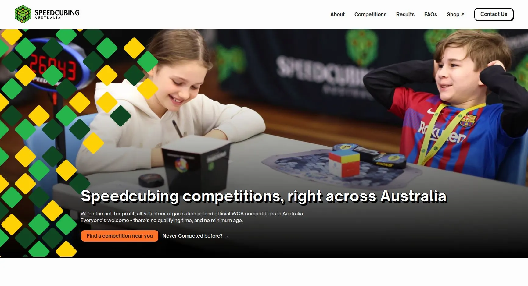
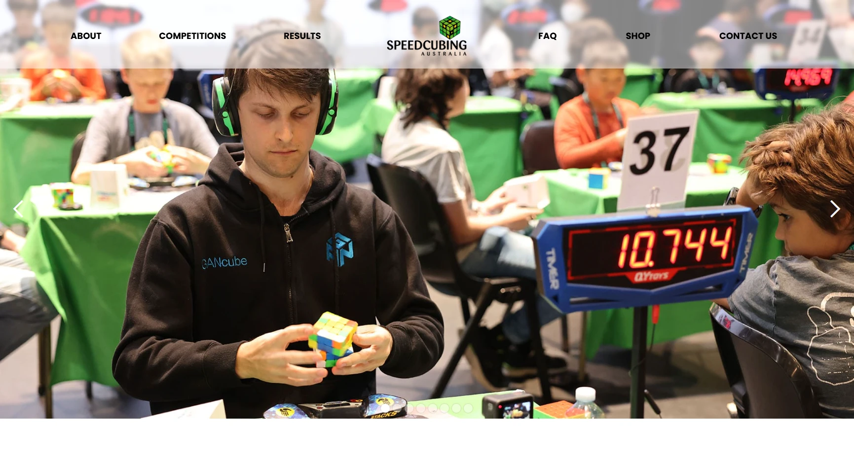
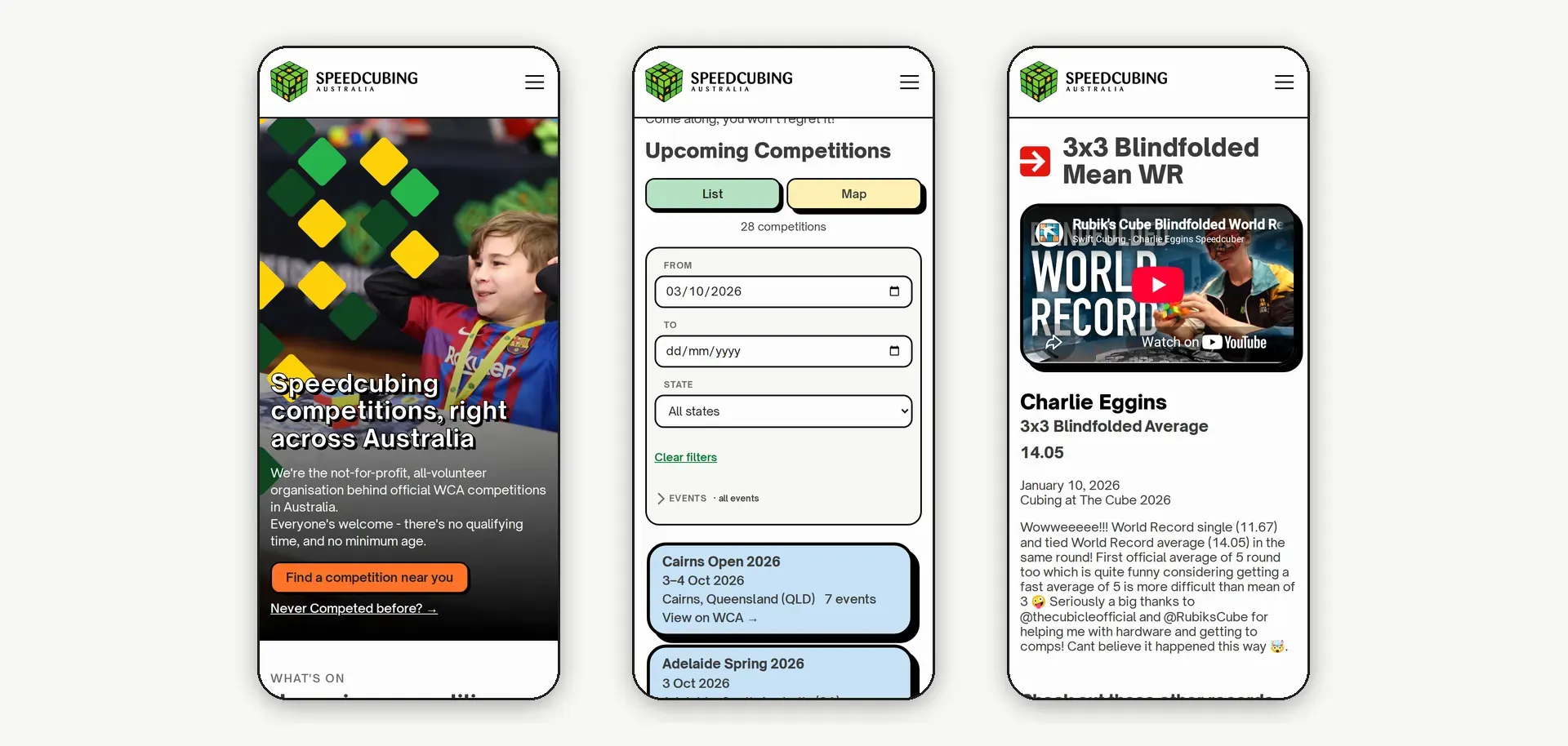
The 2023 homepage opened on a full-width photo slider. The new one opens with a single clear statement — "Speedcubing competitions, right across Australia" — and two actions: find a competition, or read the guide for first-timers. Below that it runs in the order a newcomer needs: what's on, what speedcubing is, recent records, common questions, who SCA is, and how to help.
The "What is Speedcubing?" section was added during beta testing, after a tester pointed out that venues SCA contacts, and people who find the site on Google, often don't know what speedcubing is.
Competitions, Live From the WCA
The competitions page reads directly from the World Cube Association's public API, so a competition appears on the site the moment it's announced and disappears once it's over. Nobody has to touch Webflow.
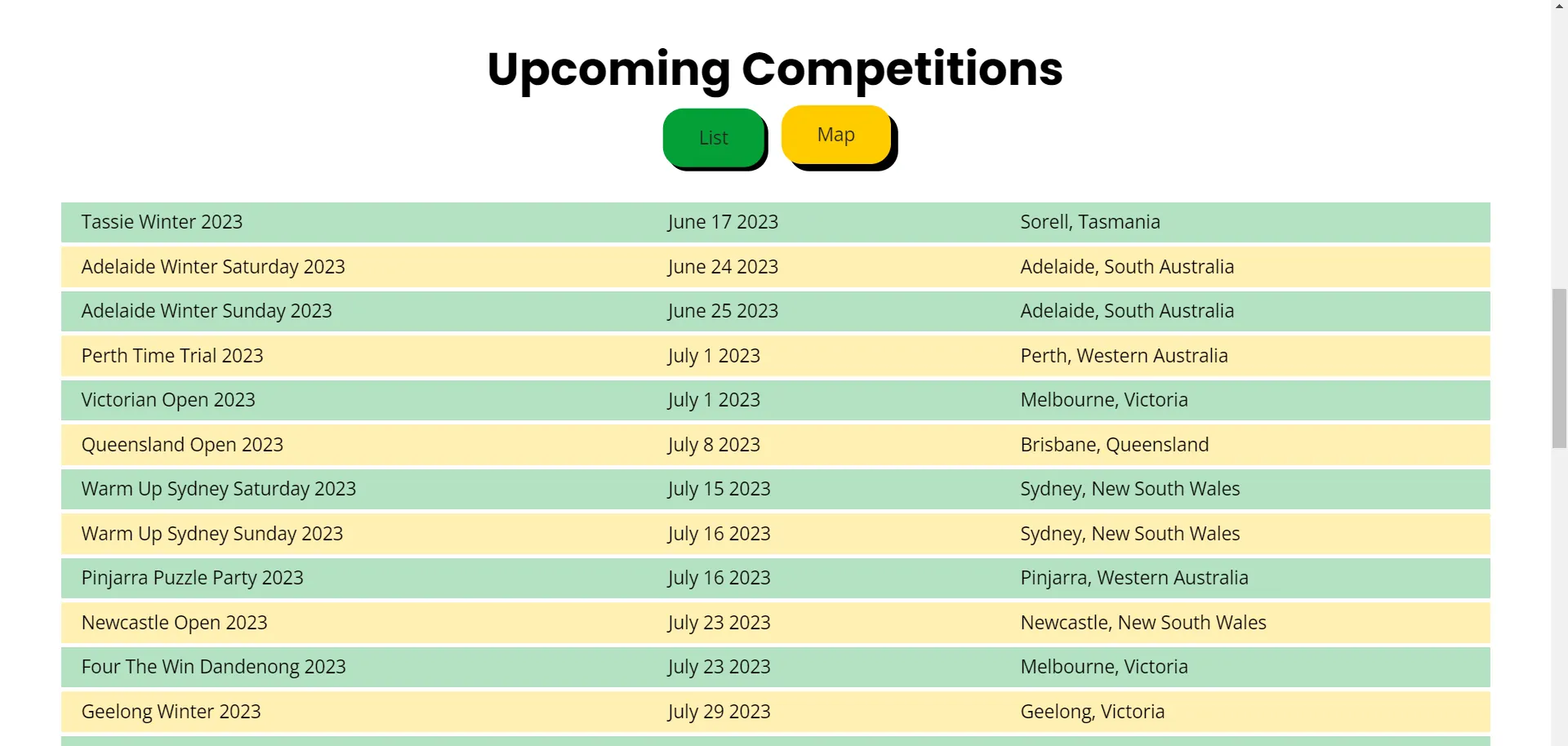
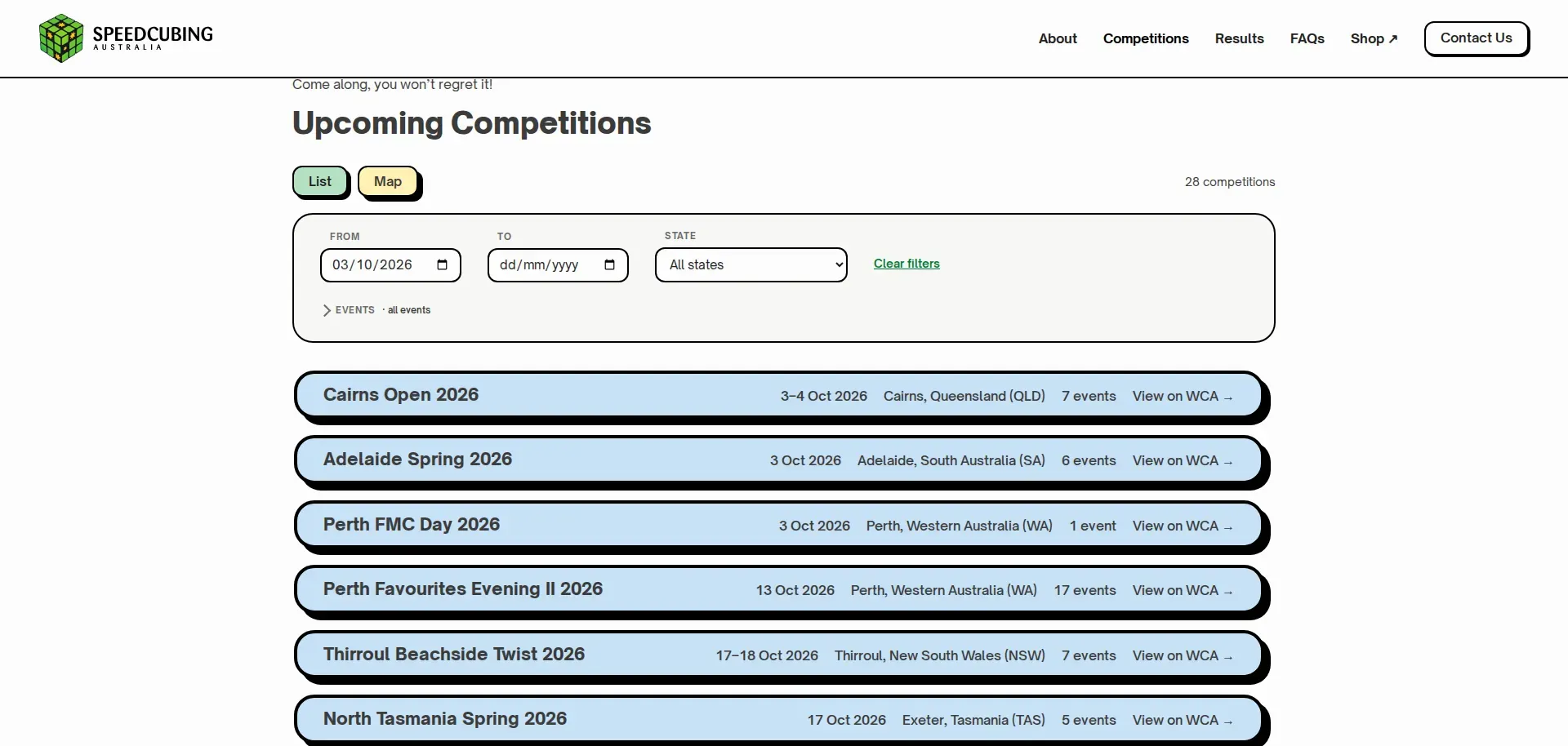
The whole finder is a single self-contained Webflow embed with no jQuery or framework behind it. It gives visitors:
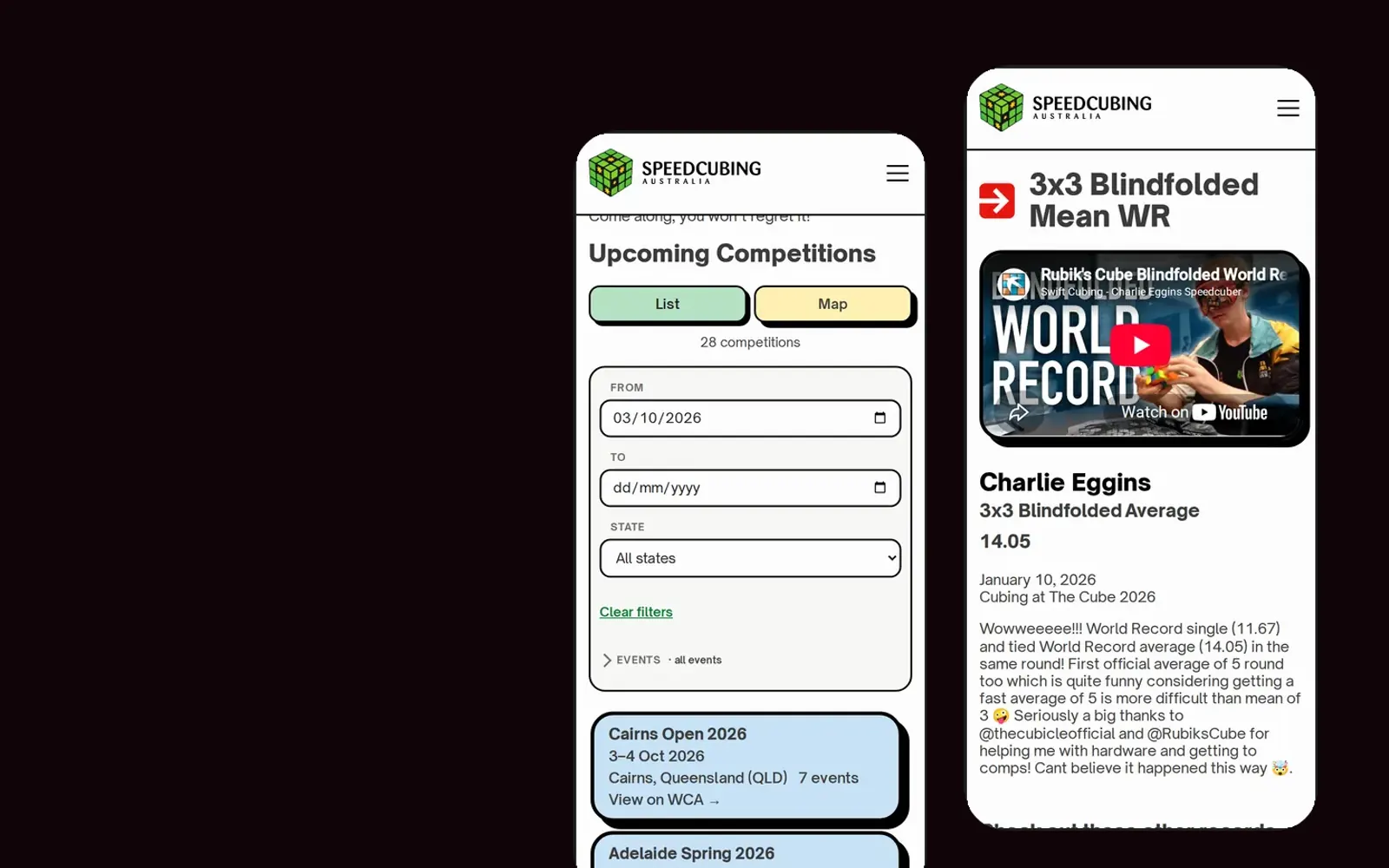
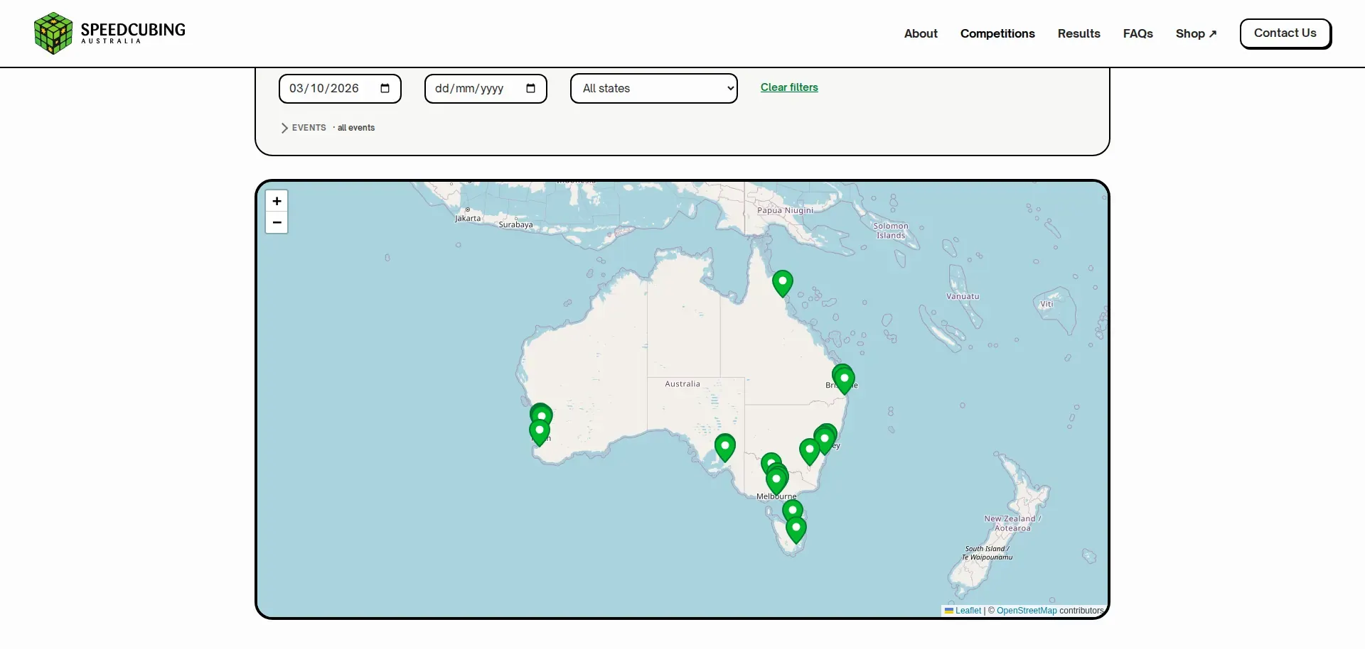
- List and map views. The list is the default. The map uses Leaflet and OpenStreetMap in place of the old Google Maps embed, and it's framed to fit all of Australia. When the state dropdown changes, the map also dynamically zooms in to just show that state.
- Filters for date range, state and event. Each event chip shows how many upcoming competitions include it ("Clock (11)"), and the event filter starts collapsed so the list is the first thing you see.
- A live count ("28 competitions") that updates as filters change.
Featured competitions that know when they're full
The homepage shows three upcoming competitions. Picking the next three by date sounds simple, but competitions in Australia often fill within hours, and promoting a full one sends people to a dead end.
So the homepage script checks registrations. It walks forward through upcoming competitions, picks the first three that still have spots, and falls back to full competitions only if there aren't enough open ones. The link text changes to suit: "Registration Open →", or something more honest when a competition is full or registration hasn't opened yet. The "See all competitions" button shows the live total.
It does this without asking the WCA about every competition. It requests registrations in small batches, only as many as it still needs, and skips competitions where registration can't be open. A typical homepage visit makes only a handful of API calls.

Records and Results
The records database was the centrepiece of the 2023 build, and it stays central. The Results page now leads with a carousel of the latest records, followed by every current Australian record, split into singles and averages, with oceanic and world record badges where they apply.
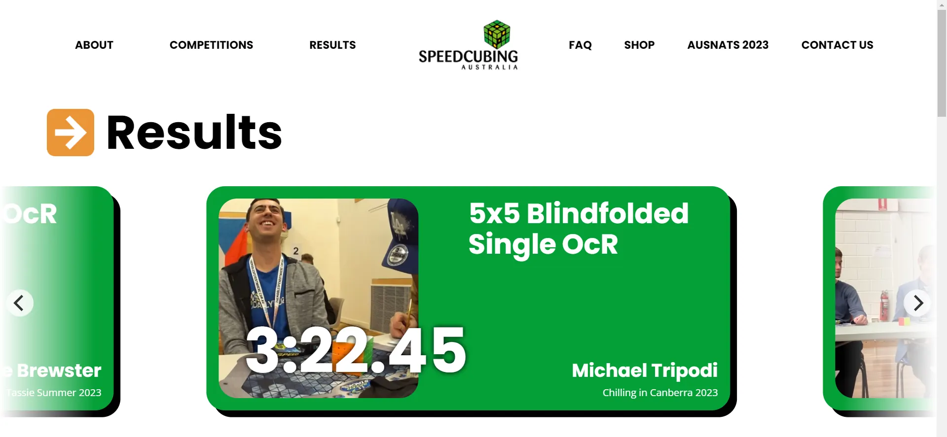
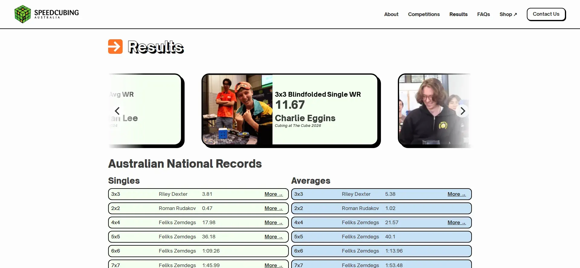
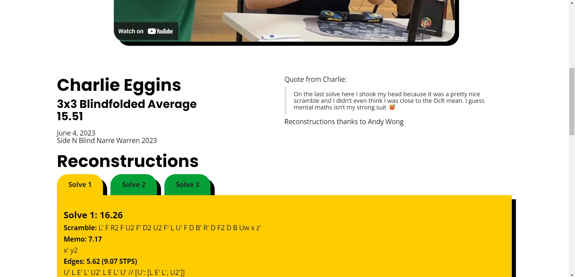
Each record has its own page: the event, the result, the holder, the competition and date, the video of the solve, and the competitor's own words about it. Underneath, "Check out these other records" links to more, so a visitor who arrives from a search for one record keeps browsing.
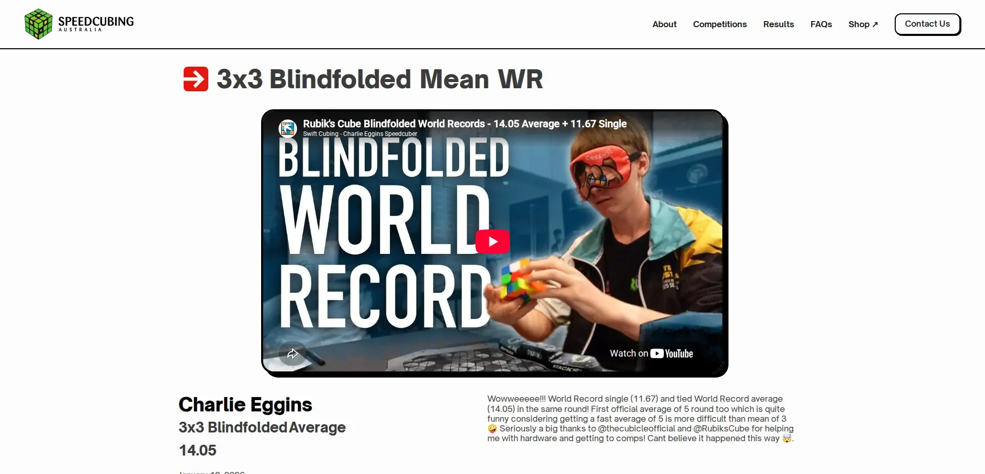
Every record page also carries structured data describing the holder and the record. That helps searches like a competitor's name surface the right page.
Contact, FAQs and First-Timers
The contact page is split into five tabs, one for each real reason people get in touch: a missed registration, a general enquiry, wanting to know more, organising a competition, or deleting a registration. Each tab has its own form and fields, so the committee gets the information they need the first time.
Each tab can also be linked to directly. A link to /contact#organise in an outreach email opens the organiser form straight away, without the visitor having to find it.
The FAQ page answers the questions every first-timer has: how fast do I need to be, how old do I need to be, do I bring my own puzzles. On the homepage, four of those questions are shown in cards that slowly scramble from one question into another, in the style of a cube being turned. The effect favours letters over symbols so it reads as words mid-turn rather than noise. It only runs while it's on screen, and it switches off entirely for visitors who've asked their device for reduced motion.
The Page I'm Proudest Of
Every site needs a 404 page. This one says "This page got scrambled", and it has a real Rubik's cube on it.
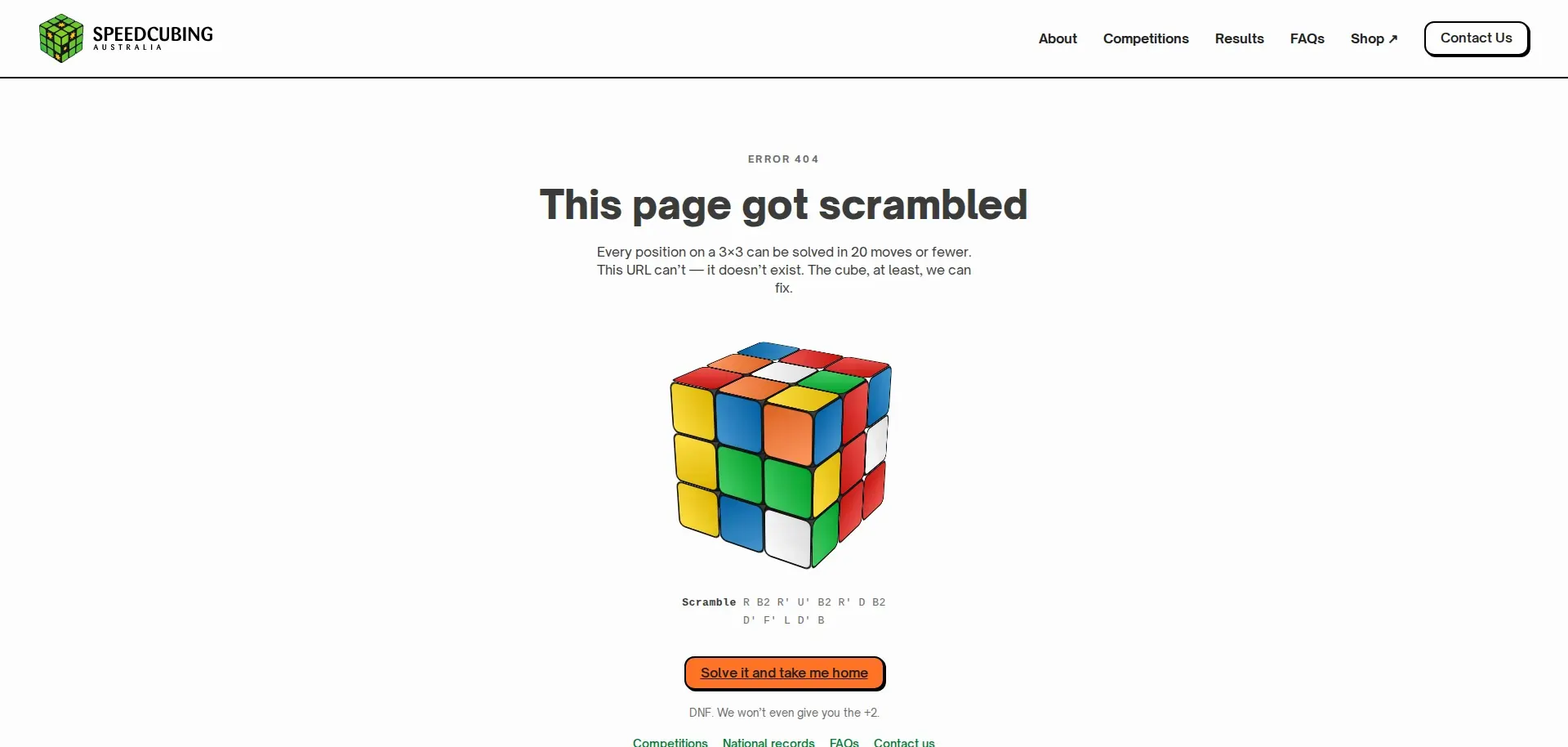
The cube is built in plain CSS 3D, with no WebGL or library: 26 pieces and 54 stickers in the brand colours. Each visit generates a fresh random 13-move scramble in official notation and prints it under the cube. When you press "Solve it and take me home", the cube plays the exact reverse of that scramble move by move, ends up solved, and then takes you to the homepage. You can also drag it around to look at it from any side, on desktop or phone.
The joke underneath is aimed squarely at cubers: "DNF. We won't even give you the +2."
Built for Phones
Most visitors arrive on a phone, usually standing in a competition venue or scrolling a message from a friend. Every page was designed and tested from 320px up. The navigation stays put while you scroll, the record carousel resizes to fit taller mobile cards, and the competition filters stack into a single column.
Under the Hood
A not-for-profit site has to keep working with nobody watching it, so a lot of this project was work you can't see:
- Structured data on every page. SCA is described once as a sports organisation and not-for-profit, with its ABN, its WCA membership and its social profiles, and every page links back to it. Competitions, records and the FAQ each get the schema that fits them.
- Accessibility. Filter chips work with a keyboard and announce their state. Every map pin has a proper name ("Cairns Open 2026, 3–4 Oct 2026, Cairns, Queensland"). Form fields have real labels, every control shows a focus ring, and animation respects reduced-motion settings.
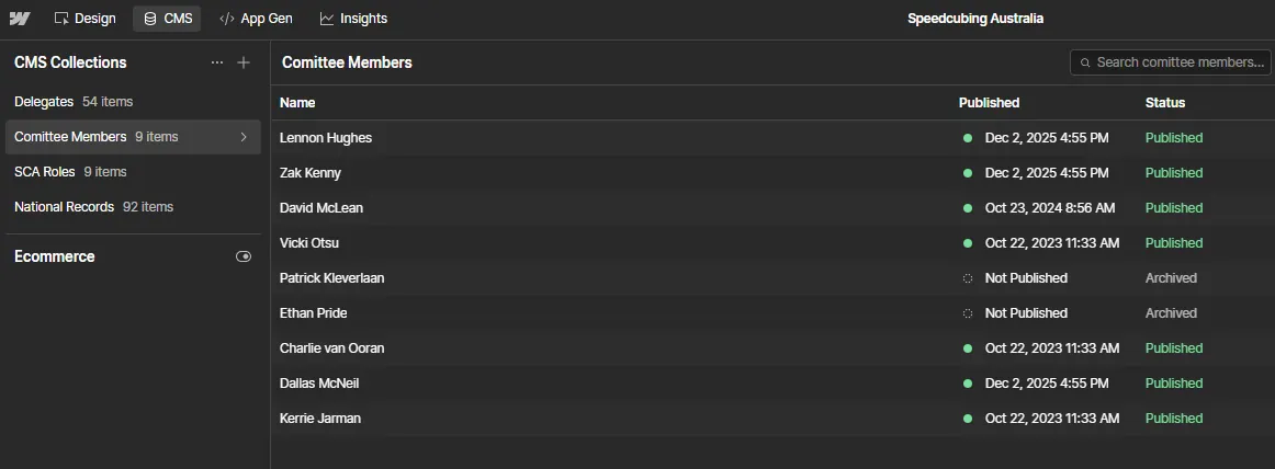
- Performance. Committee and record portraits are compressed AVIFs of around 20 KB each. The FAQ page no longer jumps around while it loads: its layout shift dropped from 0.39 to under 0.1.
- Search. Every page has a written title and description, and the sitemap and robots rules were checked before launch.
Launch
Before going live, the site went out to a group of beta testers from the community. Their feedback, plus a full audit, became a 36-item checklist of fixes ranked by what a visitor would notice first. A final audit then went over every page again at phone, tablet and desktop widths, checking for broken pages, script errors, layout overflow, broken schema and missing alt text, and confirmed none were left.
The site launched on 3 October 2026. On launch day it already held the top spot on Google Australia for "speedcubing australia", "speedcubing", "rubik's cube competition australia" and "australian rubik's cube records", ranking the 2023 site's pages. Part of the brief was making sure the rebuild kept those rankings, so the main page addresses stayed the same and every page got a proper title and description.
Outcome
For new users, the site is clearer about what speedcubing is, quicker to get you to your nearest competition, and a better home for the records the community cares about. And if you ever hit a broken link, at least you get to watch a cube solve itself.