The Brief
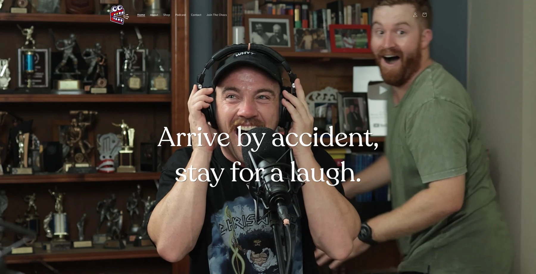
We Got The Chocolates is one of Australia's most beloved comedy podcasts. Hosted by Leigh Drennan, Mitch Drennan, and Andrew Gode, the show had grown a fiercely loyal audience — half a million Instagram followers, nearly 100 million YouTube views, and a consistently top-50 ranking on the Australian podcast charts.
The problem was the website. It didn't come close to matching the show's personality. The team needed a Shopify store and community hub that felt as bold, irreverent, and unapologetically Australian as the podcast itself. A stock theme with a logo swap wasn't going to cut it.
The Challenge
Building a Shopify site that feels genuinely made — not modified — requires pushing well past what the platform does out of the box. Every part of the experience needed to be custom: the animations, the interactions, the layout logic, the community features.
The secondary challenge was balance. This site needed to function as a real e-commerce store and as a home for a podcast community — two goals that can pull in different directions. The merch had to be front and centre without the editorial and community content feeling like an afterthought.
Design Direction
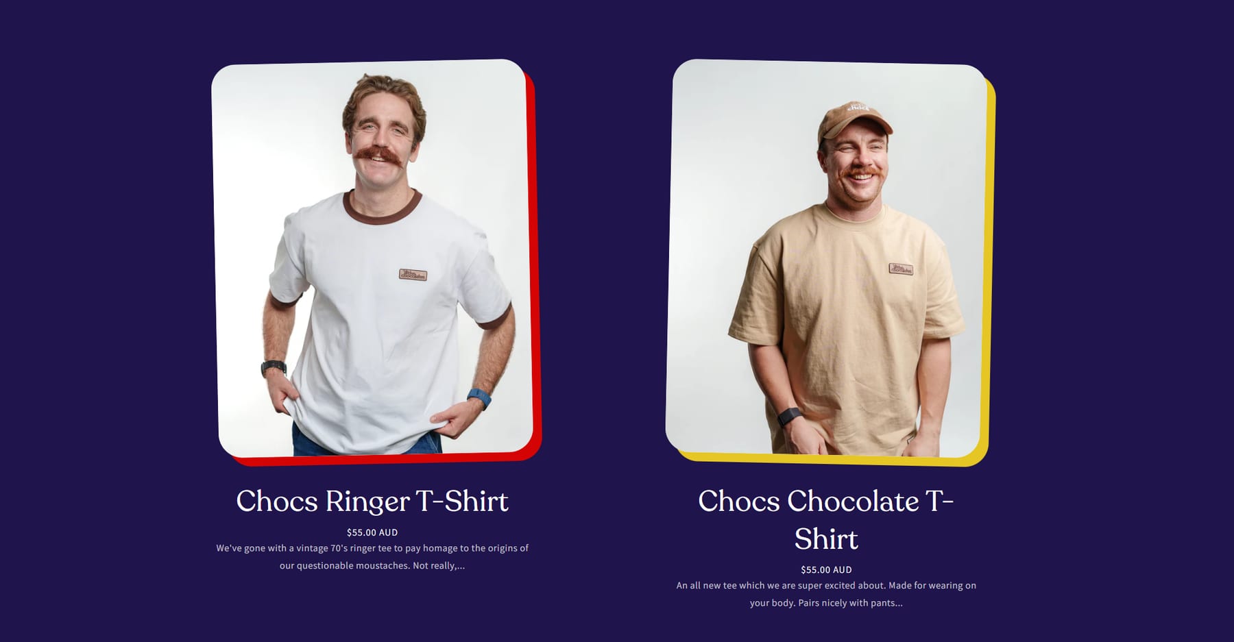
The palette came directly from the brand's existing visual identity: deep purple (#1f144b) as the dominant background, punchy gold (#e5c625) for highlights and calls to action, and red (#d40404) as a secondary accent. On screen it reads like a premium streetwear brand with an Australian-sports-club edge — confident and premium, but never corporate.
Typography pairs Recoleta — a warm, vintage-feeling display serif — with Assistant for body text. The combination strikes the right balance: you feel the personality immediately, but the reading experience never fights you.
Two full-width diagonal marquee banners run continuously across the page — one in gold, one in red — tilted at opposing angles. It's a small detail that does a lot of work.
Custom Animations
The product grid was a key focus. On desktop, hovering any product card scales it to 1.05×, applies a subtle rotation, and drops a red box shadow — giving the grid a physical, tactile quality that makes browsing feel more like flipping through a rack than scrolling a catalogue.
An adjacent description panel updates dynamically to reflect whichever product is being hovered, so the product copy does more work without cluttering the cards.
The Easter Egg
This is the part I'm most proud of.
Five "chocs" icons are hidden across the page — not invisible, just tucked into the layout at an opacity where you have to be paying attention to notice them. Each click updates a persistent counter: "You found 2 of 5." A fade-and-scale animation plays on each find. Locate all five and a lightbox fires, revealing a discount code.
It's completely optional and has zero impact on the shopping experience. But for the audience — people who've been listening to the show for years, who get the inside jokes, who would absolutely go looking for something like this — it's the kind of detail that makes a site feel like it was built for them rather than at them.
That mechanic generated genuine organic social engagement after launch, with listeners posting about finding all five icons before placing their first orders.
What Was Built
The full Shopify build covered:
- Custom Liquid sections for every page — homepage, collection and product details
- Autoplay video hero — a looping, muted background video behind the headline, setting the tone immediately on arrival
- FOTS (Friend of the Show) section — a dedicated application form for the show's exclusive fan membership card, built with custom styled inputs
- Podcast embed integrated into the lower homepage section with direct links to Spotify and Apple Podcasts
- Fully responsive — designed mobile-first throughout, since the core podcast audience overwhelmingly listens and shops on their phone
Outcome
The store launched with fourteen products across apparel, headwear, accessories and socks. The audience responded immediately — and the easter egg hunt in particular created a wave of organic content from listeners posting their "5/5" finds on Instagram.
Of all the Shopify work I've done, this is the project that has stuck with me. Not because of the technical complexity, but because the brief was genuinely fun: build something that the audience will play with. That's rare in e-commerce, and it shows in the result.