Skip to content
Case studyFreelance

Vitalis Institute

A homepage redesign for a wellbeing and high-performance coaching company: a clean bento layout, a navy gradient and restrained hints of their brand orange, designed and built in Webflow in about two weeks.
Client
Vitalis Institute
Role
Web Designer & Webflow Developer
Year
2026
Visit live site(opens in a new tab)
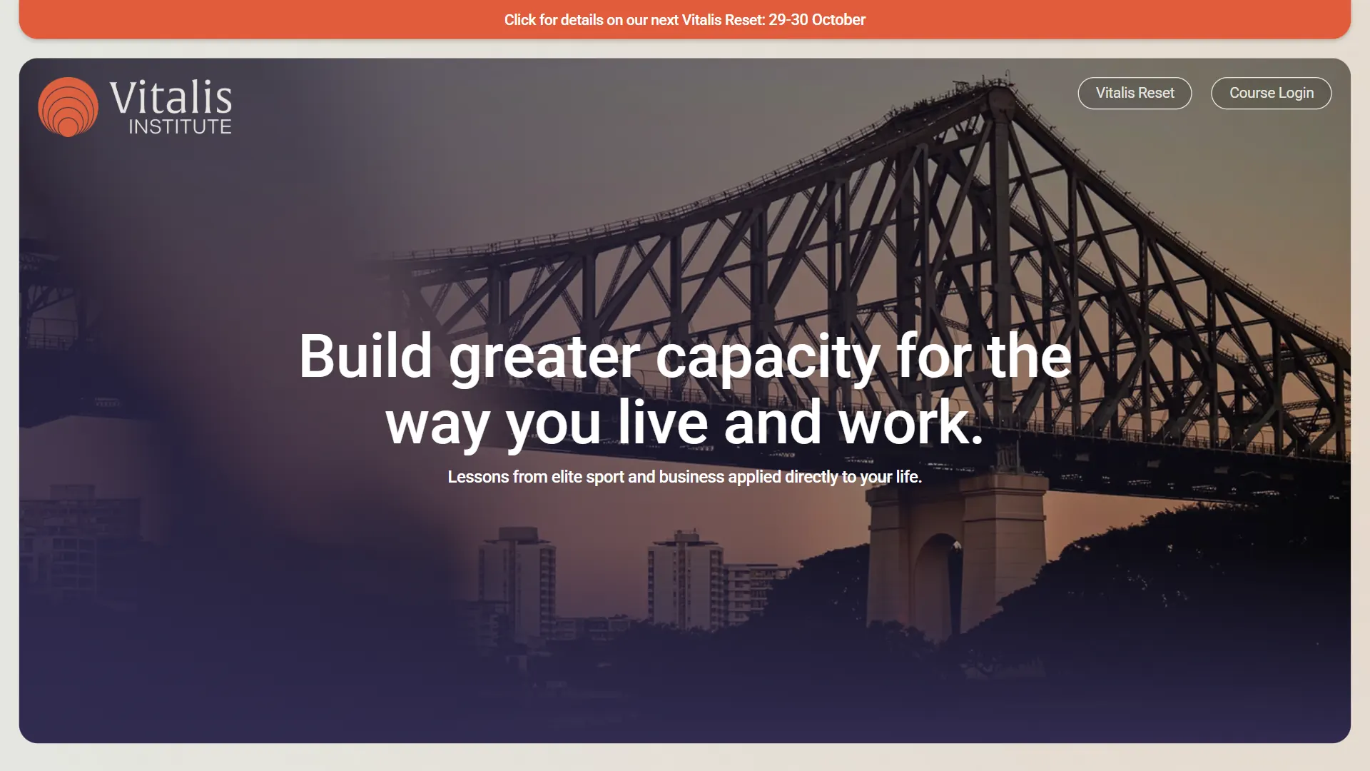
The new Vitalis Institute homepage: an orange announcement bar above a rounded hero card showing the Story Bridge at dusk under a navy gradient, with the headline “Build greater capacity for the way you live and work”

What I Built

  • Homepage redesign
  • Bento card layout
  • Navy gradient and orange accent palette
  • Offering cards with clear calls to action
  • Responsive mobile layout
  • Webflow build

Key Outcomes

Time to deliver
~2 weeks
Scope
Homepage
Platform
Webflow

Before & After

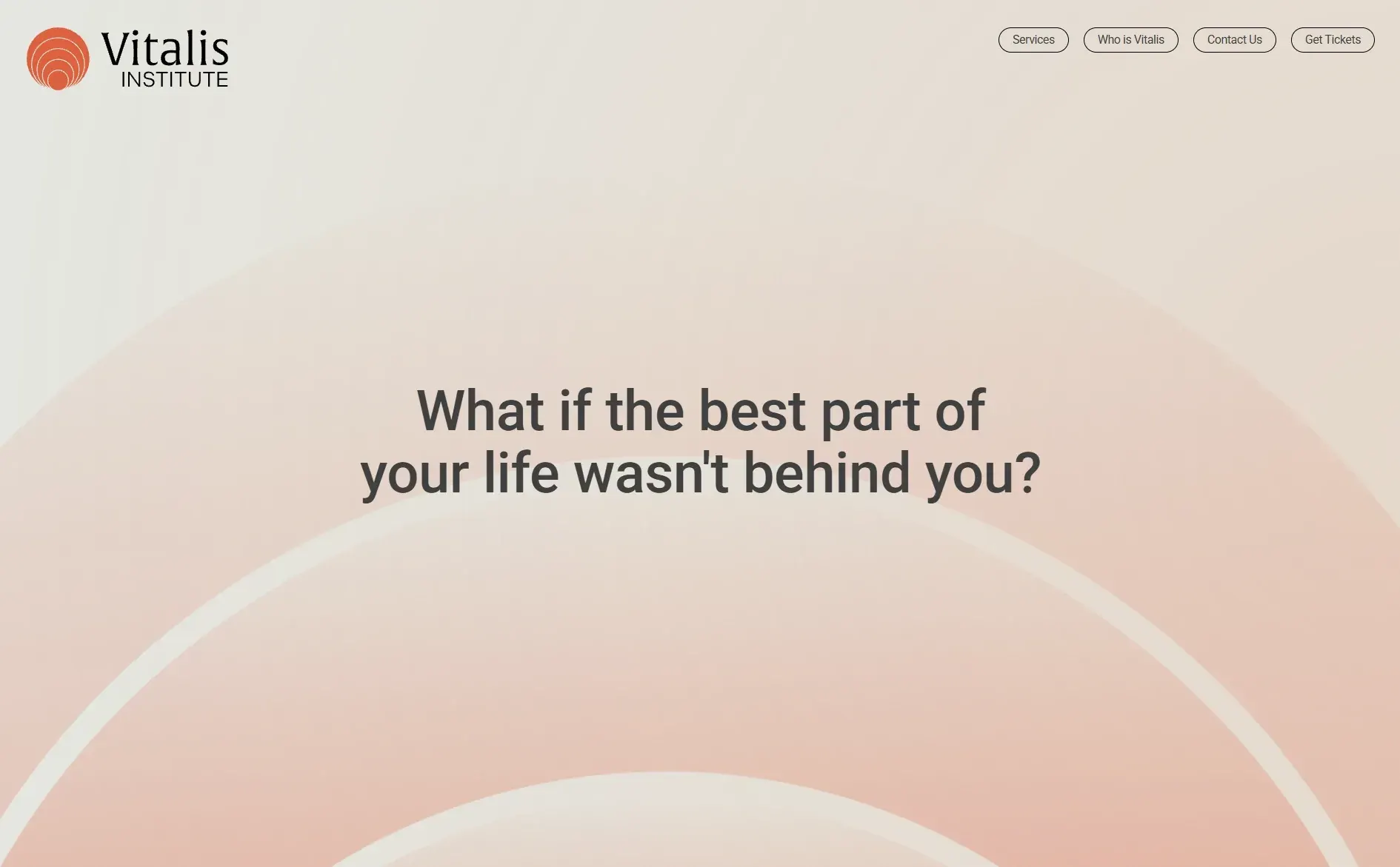
The old Vitalis Institute homepage: pale peach arcs behind the question “What if the best part of your life wasn't behind you?”The new Vitalis Institute homepage: an orange announcement bar above a rounded hero card showing the Story Bridge at dusk under a navy gradient, with the headline “Build greater capacity for the way you live and work”
Drag across the screenshot, or focus the slider and use the arrow keys, to compare the old site with the new one.

The Brief

Vitalis Institute takes what its directors learned coaching Formula 1 drivers, NBA players and hedge fund managers, and teaches it to everyday professionals and their organisations. Their buyers are executives and companies booking workshops and keynotes, and they expect the polish of any professional adviser.

The old homepage didn't speak to them. It opened on one soft question over pale peach arcs, followed by a strip of dark, abstract photography. It was atmospheric, but it never said what Vitalis does or how to work with them.

A Clean Bento Layout

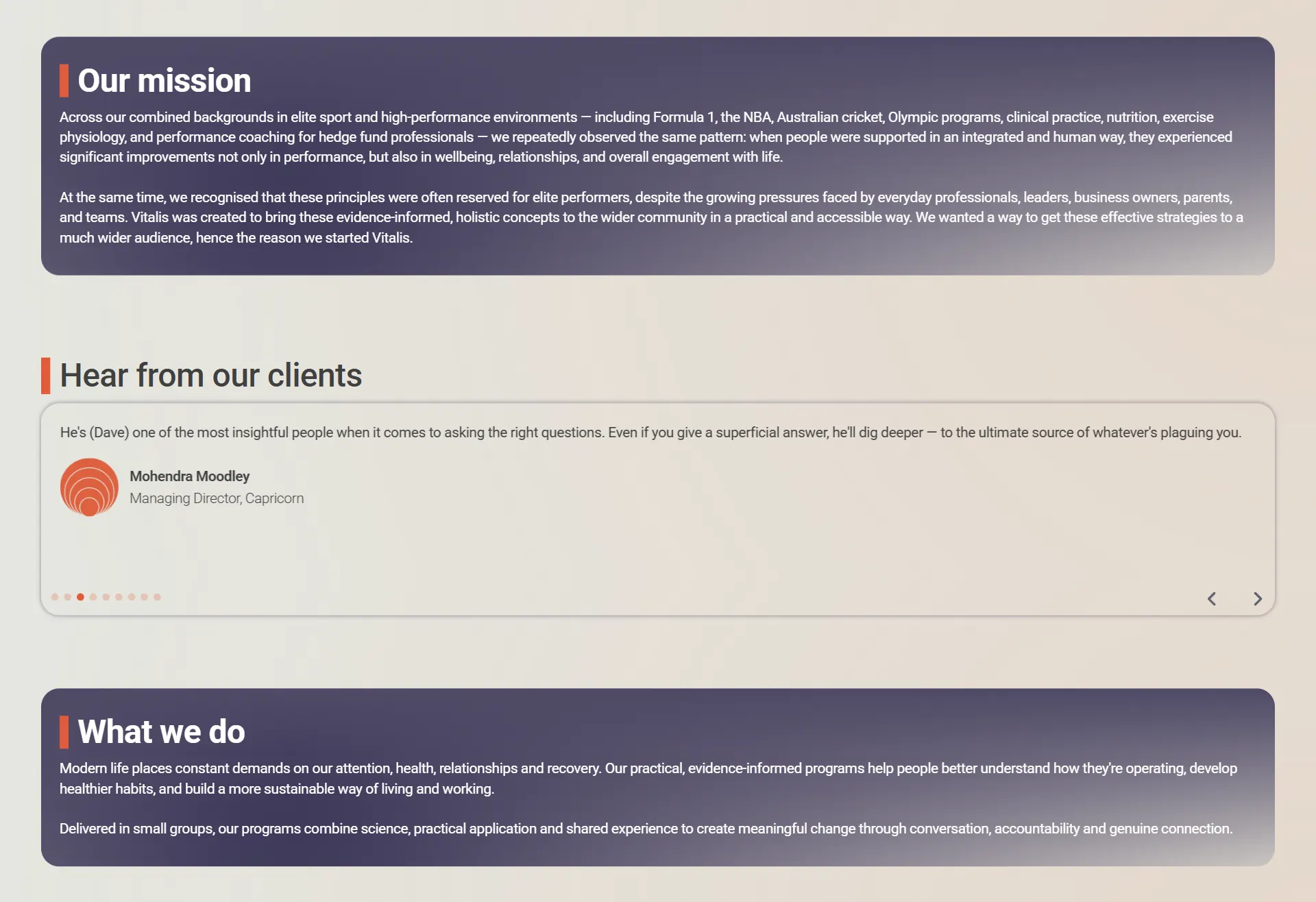
I redesigned the homepage around a bento layout. Every section sits in its own rounded card on a warm neutral background, with the same corners, padding and spacing throughout. Each card does one job (the mission, testimonials, what Vitalis does, the directors, the offerings), so visitors can scan the page and stop at the part that matters to them.

The page now opens by saying plainly what Vitalis offers: "Build greater capacity for the way you live and work."
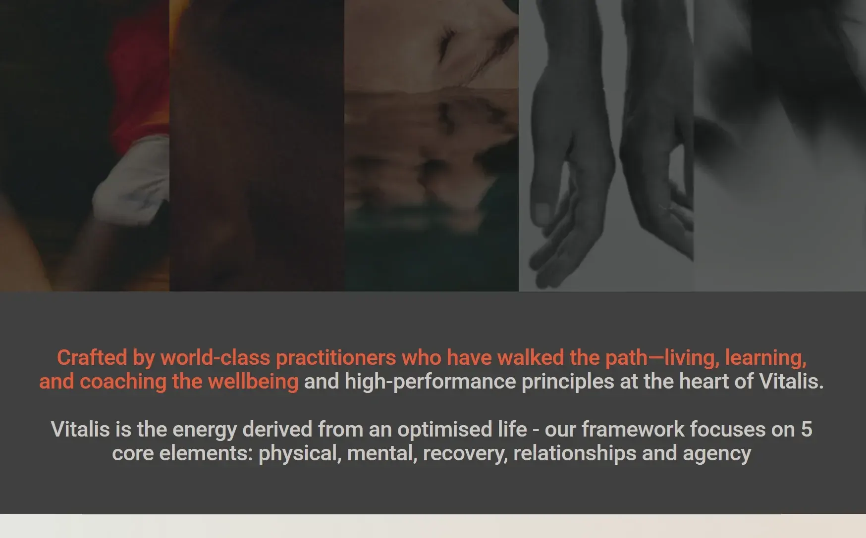
The old homepage: a strip of dark, blurred photos above a grey panel with the mission statement in orange and grey text
Before
The new homepage: navy gradient cards for Our mission and What we do, with a testimonial card between them, each heading marked by a short orange bar
After

Vitalis's orange is a strong colour, and a page full of it reads as loud rather than credible. I introduced a deep navy gradient for the hero and the key cards. It gives the page the calm, considered tone of a professional services firm, and white type sits on it cleanly.

The orange is saved for the moments that matter: a short bar beside each section heading, the buttons and the announcement banner. Because it's used sparingly, it always points to the next step.

Offerings Up Front

Vitalis offers four things: the Vitalis Reset program, a performance assessment for organisations, workshops and keynotes. Each now has its own card, with the navy tint over real event photography and, where there's a page to go to, an orange button straight to it.
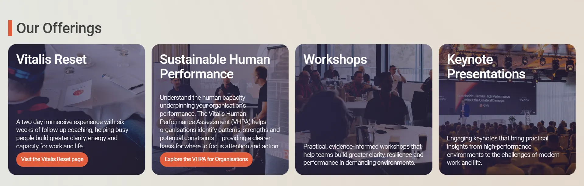
Our Offerings: four photo cards with a navy tint, for Vitalis Reset, Sustainable Human Performance, Workshops and Keynote Presentations, two with orange buttons
The offering cards

On Mobile

On phones the cards stack into a single column and keep their rounded corners and spacing, so the page feels as composed as it does on desktop.
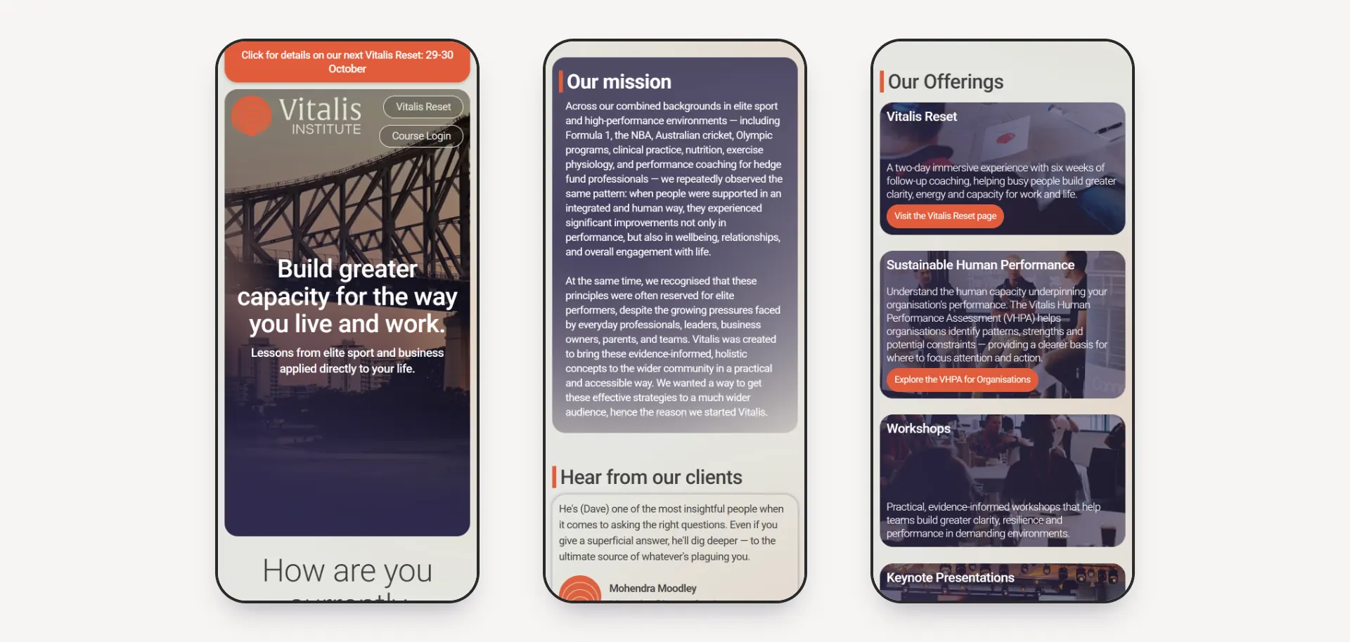
Three phone screens: the hero with the Story Bridge, the Our mission card, and the stacked offering cards
The homepage on mobile

Outcome

Designed and built in Webflow in about two weeks, the new homepage is clear about what Vitalis offers, credible to a corporate audience, and still recognisably theirs.
More work

  • Pro-bono
    • Webflow
    • UI Design
    • API Integration

    Speedcubing Australia 2026

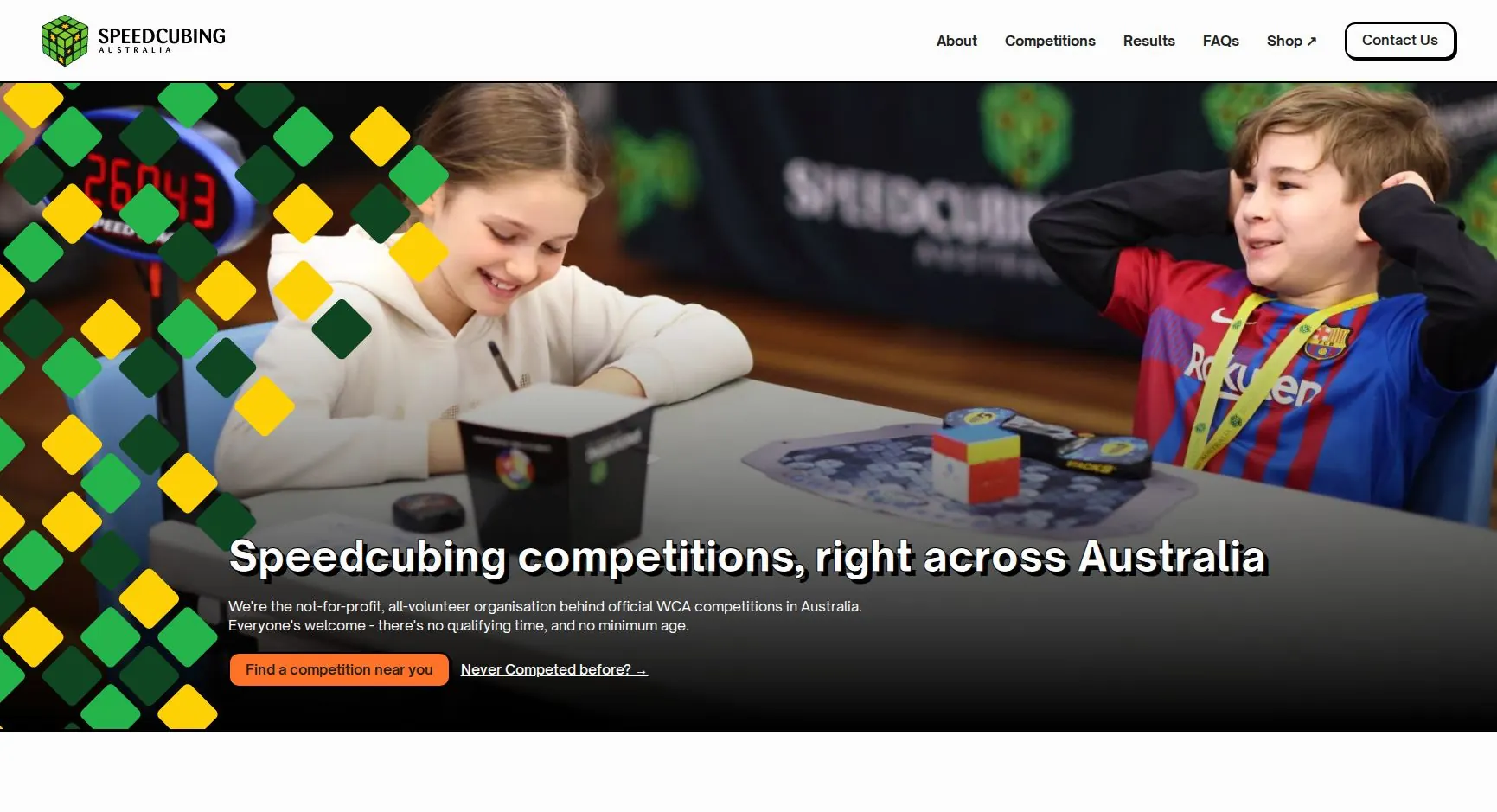
    I built Speedcubing Australia's website in 2023. Three years later I redesigned it on a refreshed brand, with live WCA competition data, rebuilt records pages and a full accessibility and SEO pass before launch.

  • SLATE
    • Webflow
    • Branding
    • UI Design

    VennCap Real Estate

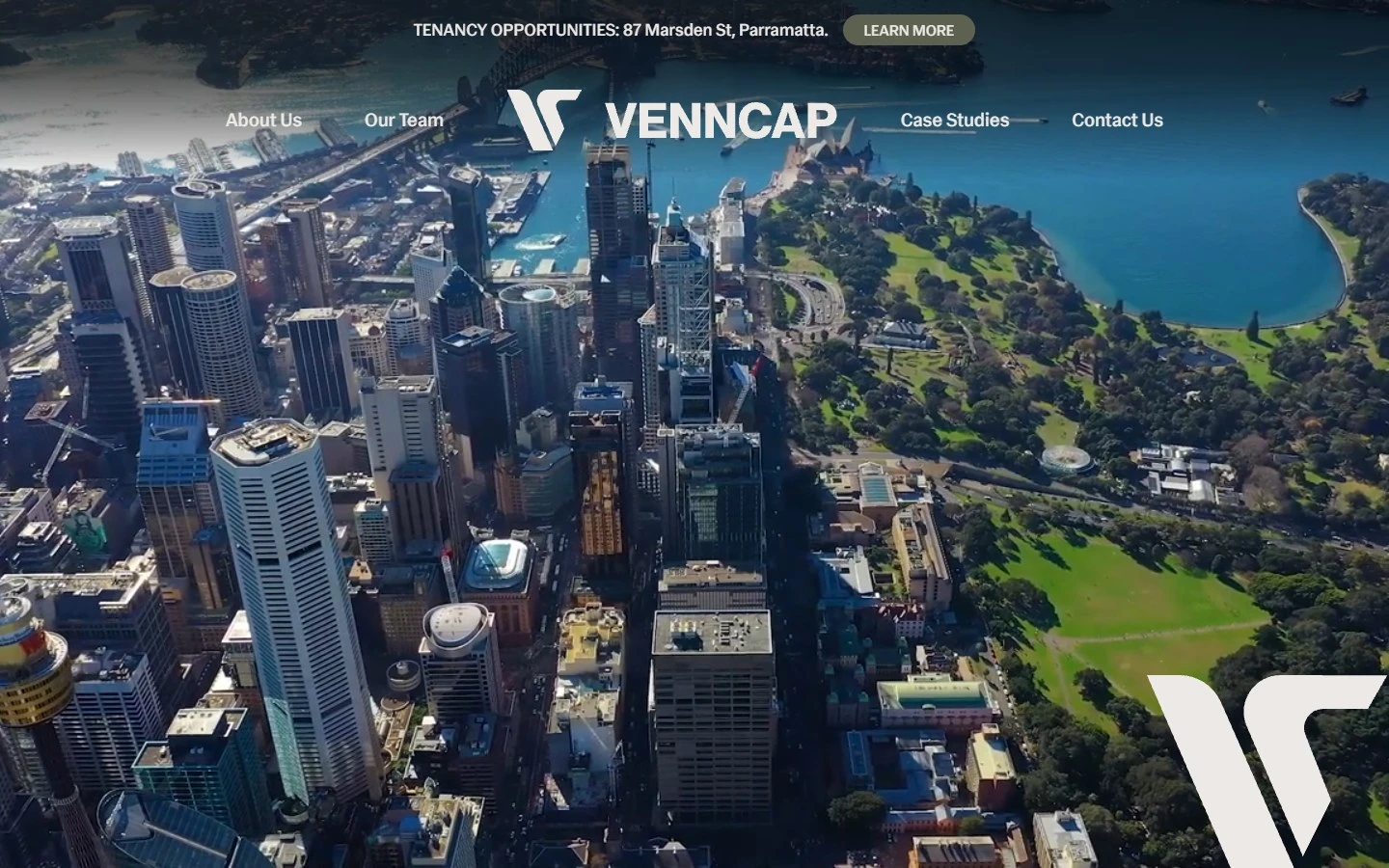
    A full brand identity overhaul and Webflow rebuild for a specialist real estate investment firm managing $0.93bn in assets.

  • Pro-bono
    • Webflow
    • UI Design
    • CMS

    Speedcubing Australia 2023

    The original 2023 Webflow build for Australia's national speedcubing organisation — interactive competition map, live records database, and community-driven CMS.

Next case study

Sippy Tom

A complete brand refresh and Webflow site for a boutique Brisbane cafe — delivered in two days to meet a tight budget.