Why Build a Daily Game
Wordle showed how much people love one small puzzle a day that everyone shares. I wanted to make one of my own, and I wanted it to be a different kind of game from a word grid with new colours.
Before designing anything I studied more than twenty popular daily games: why people come back, why they share, what makes a result worth posting in a group chat. That became a short set of rules I tested every idea against. The result had to be shareable without spoilers, everyone had to get the same puzzle, a game had to take under five minutes, and the rules had to fit in one sentence.
I wrote up two dozen game ideas on paper and scored them. Most were cut for being too complicated, too reliant on other players, or too close to something that already exists. The one that survived had the simplest rule of the lot.
The Game in One Sentence
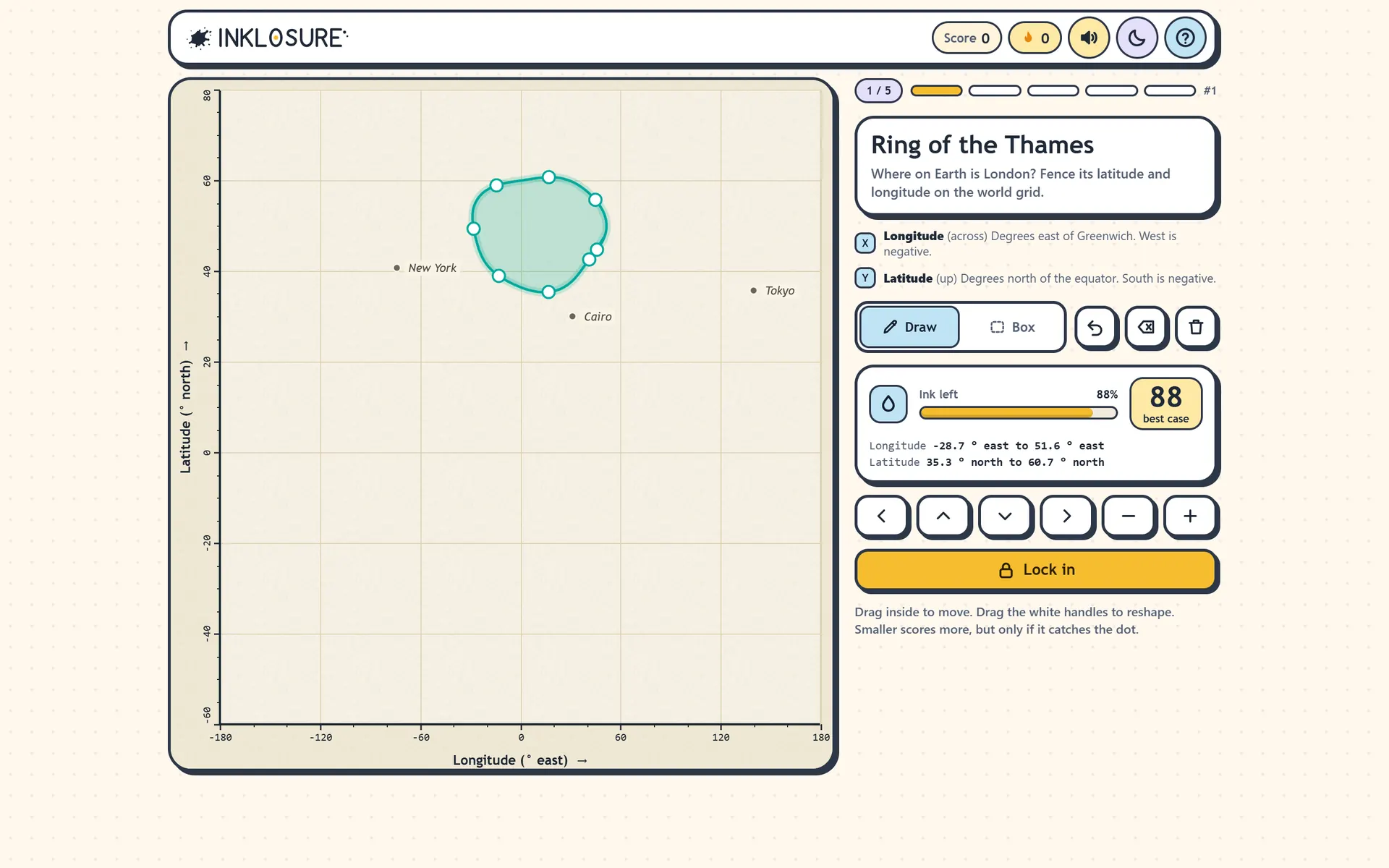
Draw a fence round where you think the hidden dot is. The less ink you use, the more you score.
Each question is a chart with two everyday measures, like when a film came out and how long it runs. Somewhere on that chart is a hidden dot. You draw a loop where you think it is. A tight loop that catches the dot scores close to 100. A huge loop is safe but scores little. A loop that misses still scores a few points if it was close.
That one rule turns trivia into a bet about how sure you are. You might know roughly when The Lion King came out but have no idea of its running time, so you draw a tall, thin fence.
Eight Days, Five Prototypes
The game went from an idea on 9 November 2026 to a public launch on 17 November. In between it went through five versions, each one driven by playing it and noticing what felt wrong.
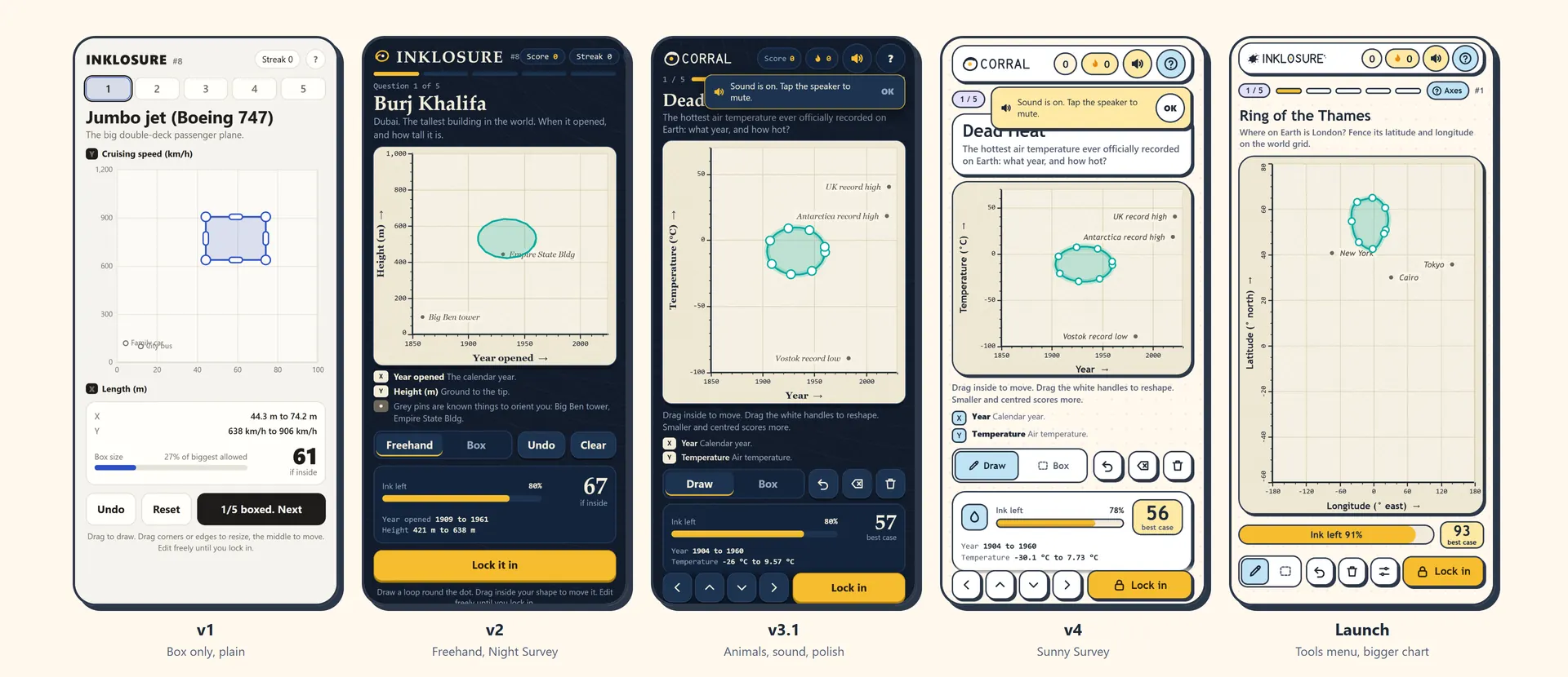
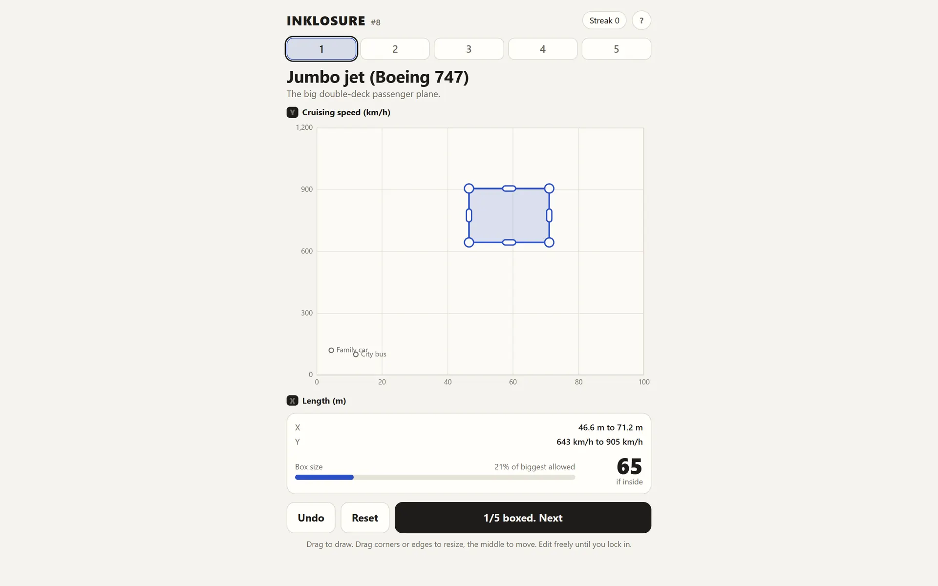
- v1 let you drag a rectangle and showed all five answers at the end. It worked, but waiting until the end killed the fun, and the reference labels overlapped each other on some charts (you can see "Family car" and "City bus" colliding).
- v2 made freehand drawing the main tool, with the box kept as a quick option. The answer is now revealed straight after each question, so every lock-in has its own small payoff. I also gave it a proper chart style: titled axes with units, minor ticks, and two or three grey reference dots like "Big Ben" or "a ten-year-old" so you can reason from things you know.
- v3 reworked the scoring, replaced a progress-bar share card with animals, added sound, and fixed every overlap at the root by never drawing text on the chart except the reference labels. A layout audit checked every element against every other at eight screen sizes, from a 320px phone to desktop and landscape.
- v4 moved from a dark navy look to a light, friendly one: cream paper, chunky outlined cards with hard shadows, pastel tiles and a gold "lock in" button. Light is the default, and dark mode is available.
- Launch rebuilt the whole thing with a real backend, and reworked the phone layout so the chart gets almost the full screen.
Scoring That Feels Fair
The scoring went through more rounds than anything else, because it decides whether the game feels generous or mean.
The rule I set early on: a fence that catches the dot scores between 25 and 100 depending on how tight it is, and a fence that misses scores between 0 and 25 depending on how close it got. A near miss is never a zero, so being brave isn't punished too hard.
The first curve was too stingy. A fence using 10% of your ink only scored about 75, which felt like a telling-off for a genuinely good guess. So I reset it around how players actually think: 3% of your ink or less scores 100, 5% scores 99, 10% scores 92, and a quarter of your ink scores 70. I also cut how much centring matters. Early versions punished a dot near the edge of your fence heavily; now bad centring costs at most 5 points.
A perfect 100 is a Bull (as in bullseye), and it needs a tiny fence with the dot right in the middle. Anything from 90 to 99 gets Goat status, which wears a little crown.
One edge case needed a ruling: what if someone draws a doughnut? Loops that cross themselves are allowed, but the hole in the middle isn't fenced and doesn't cost ink. If the dot lands in the hole, the game tells you that's why you missed.
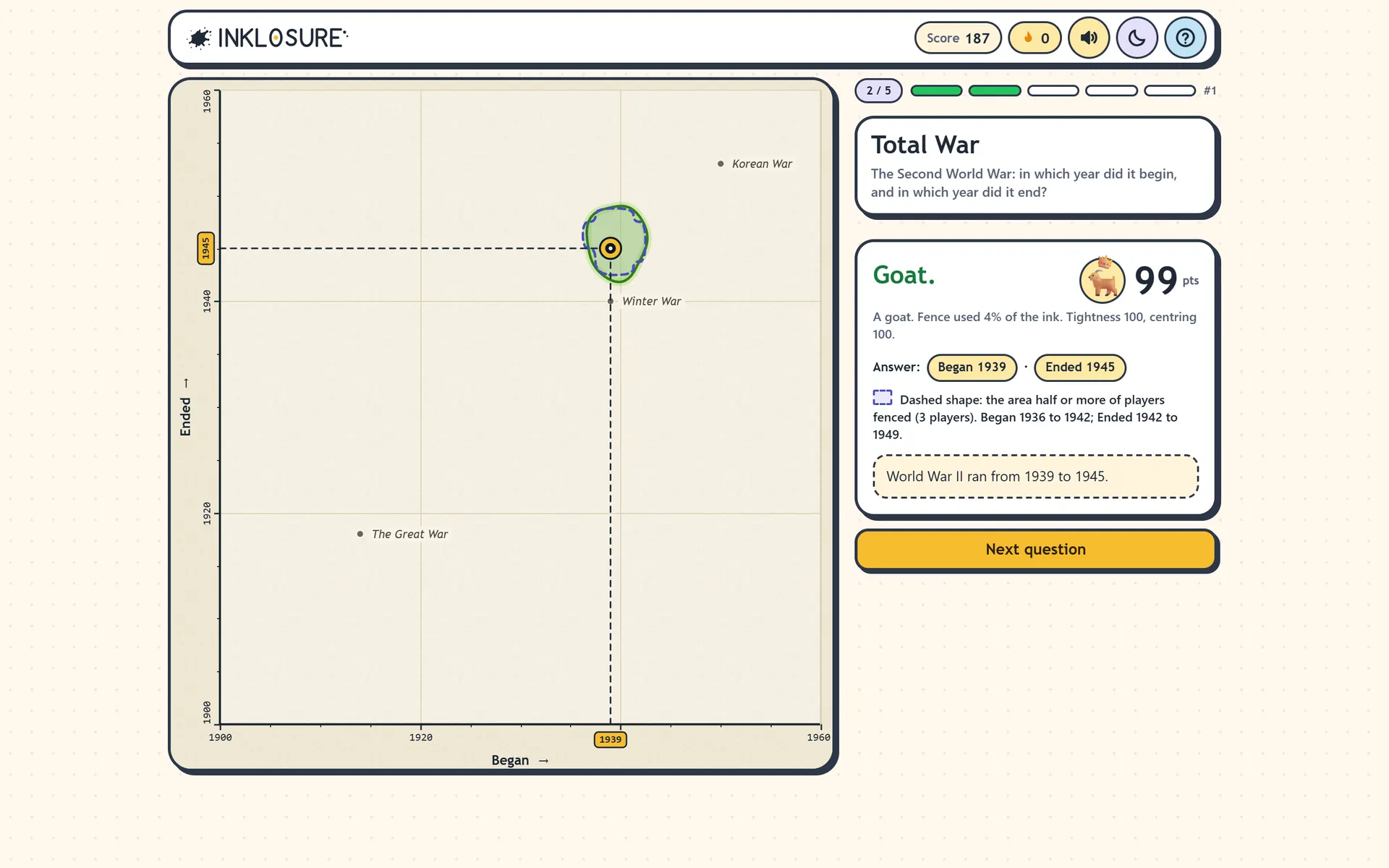
On the reveal, the chart dims, two dashed lines slide in from the axes, and a gold stake stamps down where they meet, with a small shake, a ripple and a buzz on phones that support it. Your fence turns green or red, points count up, and a one-line fact fades in. It all takes under two seconds, and it's skipped entirely for anyone who has asked their device for reduced motion.
A Share Card Made of Animals
The share card was designed before most of the game existed, because it's how a daily game spreads. It had to be plain text that pastes cleanly into any group chat, give nothing away about the answers, and still make sense to someone who has never played.
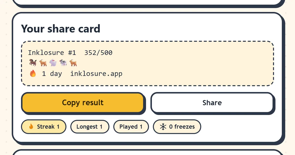
The first version used little progress bars. They were accurate but forgettable, so I swapped them for one farm animal per question:
Inklosure #1  466/500
🐐🐐🐐🐎🐐
🔥 1 day  inklosure.app
Every animal is something you could pen in a fence. The Bull is the best, then the Goat, Horse, Cow, Pig, Sheep and Chicken as fences get roomier. A miss is a Rabbit, because it got away. A rough day becomes a funny line of animals, and people share bad days too.
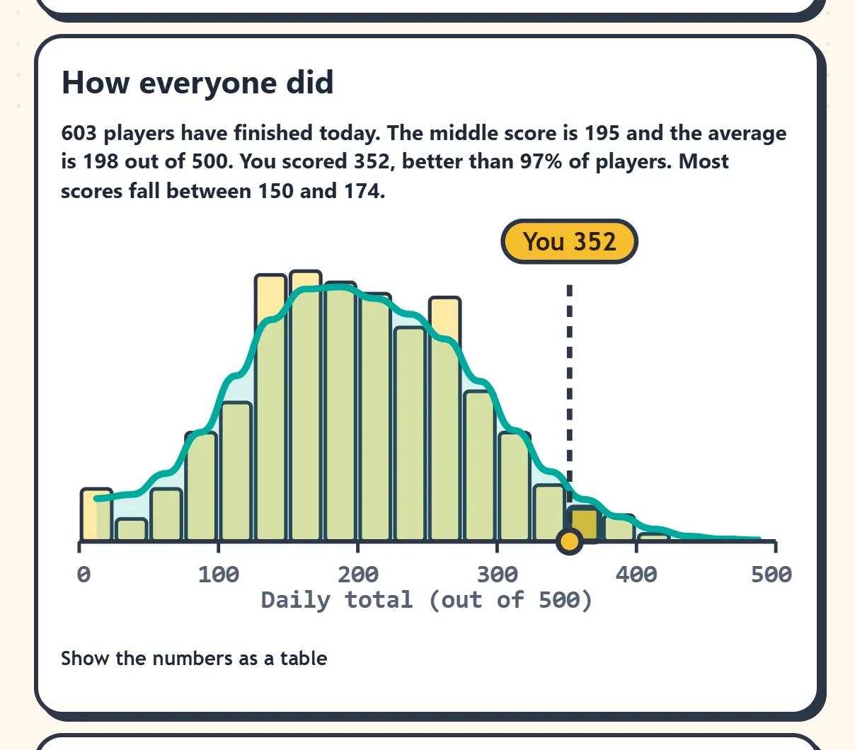
After the fifth question, a histogram shows how everyone else scored that day, with a "You" marker and a plain-English summary ("better than 97% of players"). It has a table view and a text summary, so it doesn't rely on seeing the chart.
Everyone Else's Fence
After each answer, a dashed outline shows the area that at least half of that day's players fenced. You can see whether you were with the crowd or out on your own, and whether the crowd was right.
The first players of the day would see nothing, so the admin console lets me draw a "seed" fence for each question ahead of time. It counts as one early guess, and once real players arrive it's just one voice among hundreds.
The Questions
Every question follows the same rules:
- Two axes a normal person has a feel for, like year, weight, height, speed or price. No specialist knowledge.
- At least two grey reference dots that help you reason ("bigger or smaller than Titanic?") without giving the answer away.
- Nothing microscopic. Questions about cells and atoms were removed because nobody has a feel for those sizes.
- A short, catchy title above a plain question. The brief I gave myself was something like "Banana for Scale". The launch bank has titles like "Ring of the Thames" (where is London?), "Hakuna Minutes" (The Lion King) and "King of the Bedroom" (a king-size mattress).
- Don't give the answer away in the question. An early question asked how heavy a "one-tonne gold coin" was, on an axis of weight, so the answer was in the question. I rewrote it, and an automatic check now screens every question's visible text for its own answer.
The bank has more than 500 questions, with numbers checked against sources. They're split into two pools: a fixed set of 100 for the unlimited "endless" mode, and the rest for the daily puzzle, which gives roughly two months of dailies before any question can repeat. Each day runs from easier to harder. There are also themed days, with questions that only appear on their date: Christmas, New Year's Eve, Valentine's Day, Pi Day, Easter, Earth Day, Moon Landing Day and Halloween.
A Name and a Logo
The game was called Corral for most of its development, since you're rounding up a dot. I wanted something that leaned into the ink. Inkling and Inkompass were taken, so I went with Inklosure (ink + enclosure).
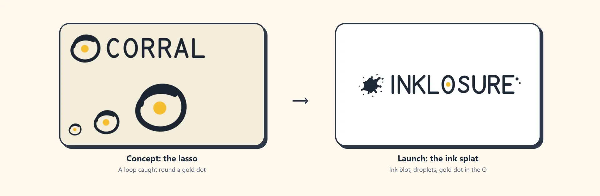
The first logo was a hand-drawn lasso caught round a gold dot. On paper it was clever, since it shows the game's own gesture. In practice it looked like an egg frying in a pan. So it was dropped for an ink splat with flicked droplets, and the gold dot moved into the O of the wordmark.
Built for Thumbs
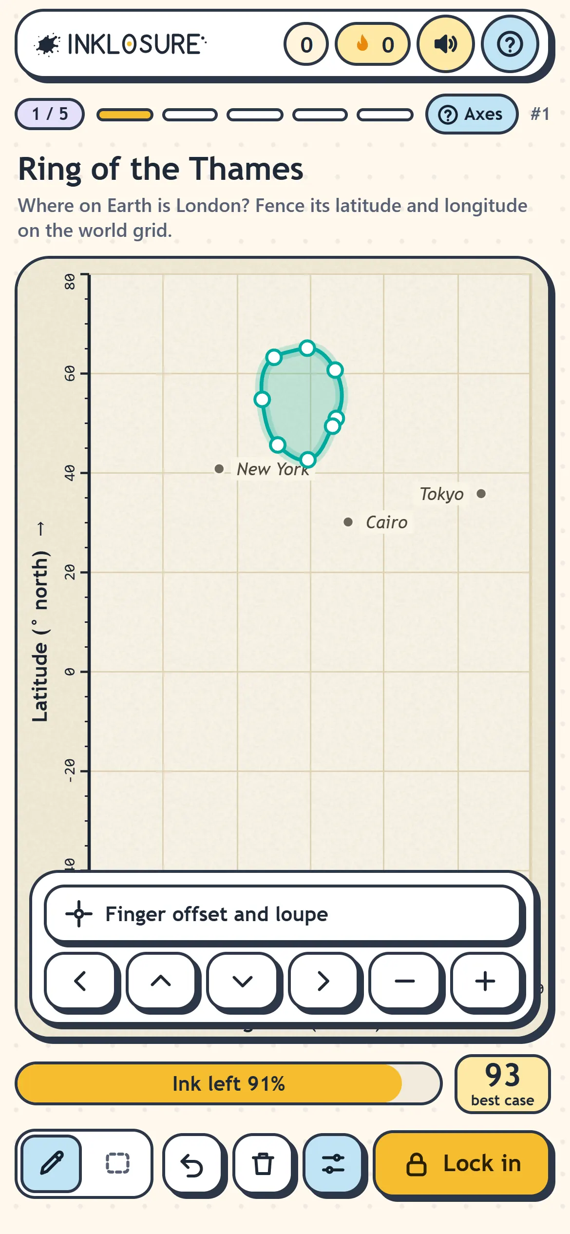
Most people play a daily game on their phone, in a spare minute, with one thumb. On a small screen the chart is everything, so I kept cutting things away until it filled the screen.
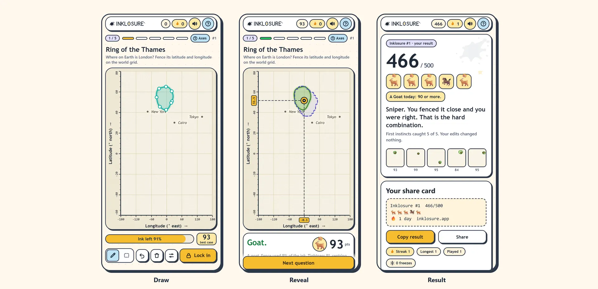
- A tools menu. The nudge arrows, resize buttons and loupe used to sit under the chart. They now live behind one button in the toolbar, which freed up a lot of height, and the chart grows to fill it.
- A vertical y-axis label, which saves a surprising amount of width on a 360px screen.
- Finger offset and a loupe (optional), so your fingertip doesn't hide the tiny loop you're drawing.
- A pen that knows when you're finishing. As your stroke gets close to where it started, a ring swells and turns gold, and letting go snaps the loop shut.
- An ink meter that wobbles when you're low, and a pen that stops cleanly when you run out instead of jumping across the chart.
- Every touch target at least 44px, with no double-tap zoom delay, and the page sized around the phone's notch and browser bars.
Listening to Beta Testers
The first feedback from beta testers was clear: the game was really hard. My guess was that they were drawing tiny, nervous loops and missing. I built help that appears only when it's needed.
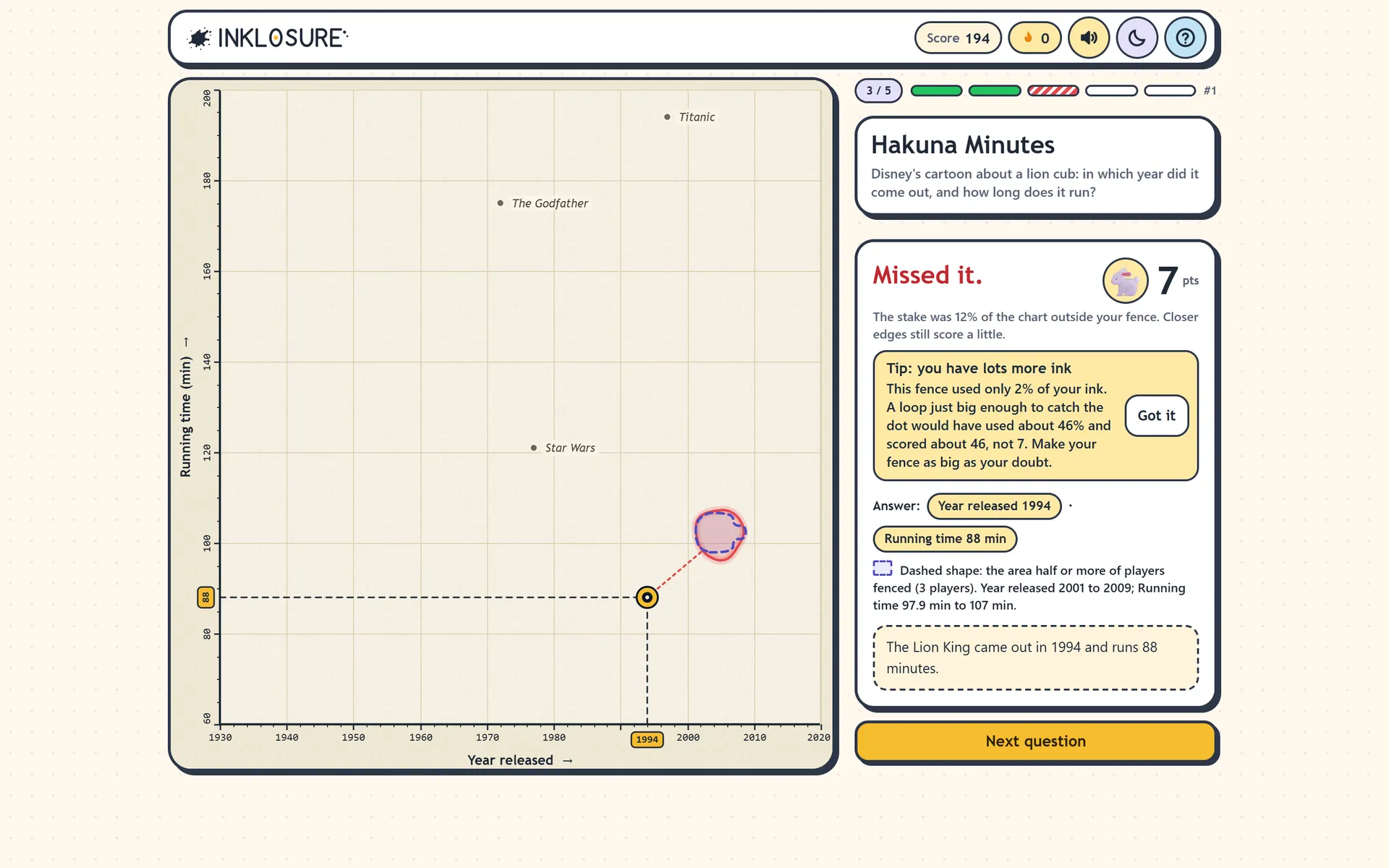
- A small-fence tip. If you miss with a fence that used under 15% of your ink, the reveal shows a tip with your own numbers: how much ink you used, and what a fence just big enough to catch the dot would have scored. "Make your fence as big as your doubt." It appears on a new player's first tight miss, but only after two in a row for anyone more experienced (one tight miss is a normal gamble), at most three times ever, and never again once you press "Got it".
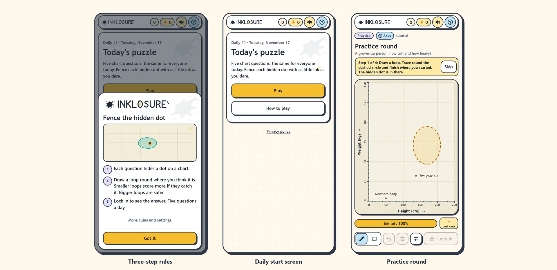
- A practice round for first-time players, on a real chart with a dashed template showing where to draw. It walks through drawing a loop, using the box, resizing it and locking in, in four steps, with Skip always visible.
- A calmer first visit. The how-to sheet now has three points: each question hides a dot, smaller loops score more if they catch it (bigger loops are safer), and lock in to see the answer. The full rules and settings sit behind a link. A "sound is on" popup that used to appear on first load was removed, because new players should be focused on the game.
- A start screen. The daily puzzle opens on a start screen with the day number and a Play button, and the practice round only runs after you press Play.
The beta results also shaped the first week. I used the scores from endless mode to see which kinds of questions players did well on, and picked an easier first day, with each day's fifth question a little harder than the last. One question scored suspiciously well, until I remembered that a lot of my testers solve Rubik's cubes and it was about Rubik's cubes. That one was left out of the calculations.
How It's Built and Hosted
Inklosure doesn't use a website platform or a game engine. Nothing off the shelf does freehand drawing on a chart, scores it on a server and keeps a live histogram of everyone's results, so I built every layer.
Why the answers live on the server
In most browser games, the answers are sitting in the page source for anyone curious enough to look. In Inklosure the browser never has them. It gets five questions with no answers, facts or names. When you lock in a fence, the shape is sent to the server, which checks it, scores it, saves it, and only then sends back the answer for that one question. Your first lock-in is final, so refreshing the page can't get you a second go.
The scoring code is shared: the exact same file runs in the browser (for the live "best case" number while you draw) and on the server (for the real score). The server doesn't trust the browser's maths, but because both run the same code, the two always agree.
The stack
- No frameworks, no build step. The game is plain HTML, CSS and JavaScript, drawn on an HTML canvas. The page is light and fast on an old phone.
- A server with zero third-party dependencies. Everything it needs is built into the platform, which means there are no packages to keep patched and nothing in the supply chain to go wrong.
- SQLite for the data. Every answer is a row: points, ink used, whether it caught the dot, the fence's bounding box and time taken. Every stat in the admin console is a plain query over that table.
- Thirteen automated test suites, covering scoring, the question bank rules, the API, the schedule picker (simulated over 200 days), sign-in, streaks and onboarding, plus a 28-check end-to-end smoke test that includes 40 players answering at the same moment.
Choosing where to host it
My first plan was a small virtual server on DigitalOcean. Before going ahead I checked whether that suited a game where traffic arrives in a spike every morning and then goes quiet, and decided it didn't. A single server means paying for it to sit idle, patching it, and hoping it copes on a good day.
So I moved it to Cloudflare Workers. The page and its files are served from Cloudflare's edge, close to every player, and never run any code. Only the API calls (answers, the histogram, sign-in) go to a Worker.
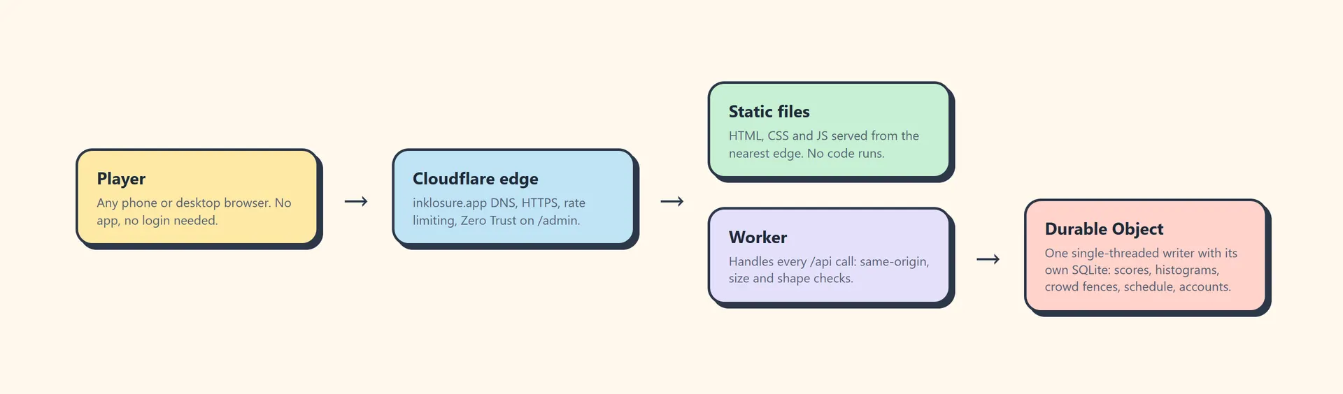
The main decision was the database. Cloudflare offers D1, a shared database built for many simultaneous writers, but the histogram and the crowd fence are built by reading a running total, adding your answer, and writing it back. With many writers at once, two players could read the same total and one answer would be lost. Making that safe on D1 would have meant splitting the crowd grid into thousands of separate rows, roughly 2,300 writes per answer, which would have blown the budget.
I used a Durable Object instead: one single-threaded worker with its own SQLite database. Every answer is handled one at a time, in order, so nothing gets lost, and the same code I'd already tested ran unchanged. The trade-off is that every API call passes through one location, which is fine at this scale. The page itself still loads from the nearest edge.
What it costs
A finished daily game writes 34 database rows. Cloudflare's free plan allows about 100,000 row writes a day, which covers around 2,000 to 2,500 games a day. That was enough to test and soft-launch for nothing. Before launch I moved to the US$5-a-month paid plan, which covers well over a million finished games a month. Upgrading needed no code change and no redeploy.
Shipping updates
Deploying is one command. The data lives in the Durable Object, not in the deploy, so pushing a fix never touches anyone's scores or streaks. A backup script exports every table, and it gets run before any risky change. On launch day, with players already in, I added a new admin feature, took a backup, deployed, and checked nothing had moved.
The Admin Console
A daily game needs someone behind the scenes choosing tomorrow's questions, so I built a private console for it.
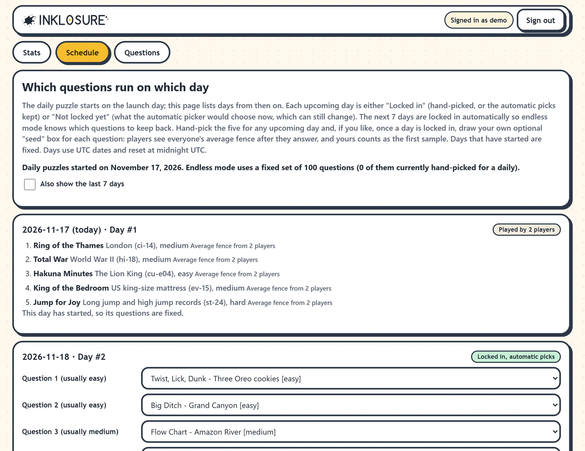
- Schedule. Every upcoming day shows what the automatic picker would choose. I can keep those or hand-pick each question from a dropdown, and the next seven days lock in automatically. The picker never repeats a question within about two months, spreads each day across different categories, and orders the day from easy to hard. Questions from the endless pool and the practice round can't be scheduled by accident.
- Seed fences. Once a day is locked in, I can draw my own guess for each question as the first sample of "everyone's fence". The true answer stays hidden unless I tick a box, so my seed is a real guess.
- Stats. Games started and finished, unique and returning players, and a ranking of every question by its real average score. Comparing that with how hard I thought a question would be shows which ones are mis-tiered. Clicking a question opens its score spread, best and worst scores, time taken and the average guess drawn on the chart.
- Question upload. New questions can be uploaded as a file and checked against the same rules as the built-in bank before anything is saved.
Accounts Without Passwords
Players never need an account. Streaks and settings live in the browser, and the game works fully without signing in.
For people who want their streak on more than one device, there's optional Sign in with Google, and only Google. I didn't want to store anyone's password, ever. It doesn't ask Google for an email, name or photo. All it keeps is a scrambled ID. Guest games played before signing in move across to the account, and endless mode then never shows a signed-in player the same question twice, on any device. There's a two-click "Delete my account and data" button.
The privacy policy is written in plain English, says the game is run from Australia, and lists a contact address with no personal name.
Security, Accessibility and Sound
Security. Before players arrived I ran a full security audit of the live site and fixed what it found. Every response carries a strict Content Security Policy with no inline scripts. Requests from other sites are refused, sizes and rates are limited both in the app and at Cloudflare, and the admin pages sit behind Cloudflare Zero Trust as well as their own login. The admin password is only ever stored as a slow hash, sessions are random and short-lived, and player device IDs are stored as hashes.
Accessibility. The game aims for WCAG 2.2 AA. Every part of it works with a keyboard: Enter places a shape, the arrow keys move it, plus and minus resize it. Buttons do the same things for anyone who can't drag. Changes are announced to screen readers, focus moves sensibly between questions, colour is never the only signal (misses are striped as well as red), contrast was checked in both themes, and all motion switches off for reduced-motion users.
Sound. All sounds are generated in the browser, with no audio files. The drawing sound is a stretchy rope that creaks and rises in pitch as your ink runs out, goes quiet when the pen stops, and makes a soft "boing" when you let go. It has its own switch, separate from the other sounds.
Launch
Before launch the site got a sitemap submitted to Google Search Console, a robots file, an llms.txt describing the game for AI search tools, and a share image so links look right in group chats.
The daily puzzle will always be free with no login. Ads are built and waiting on Google's approval. They only appear once a game has started, as a thin strip at the bottom on phones and two side panels on desktop, and they don't show on the start screen, the rules or the practice round. Streak freezes can't be bought. You earn one for every week played in a row.
Day #1 went live on 17 November 2026 at 10am Brisbane time (midnight UTC), the same moment for everyone in the world.
Outcome
Inklosure went from a list of ideas to a live game in eight days, with everything built in-house: the game, the scoring, the backend, the admin tools, sign-in and hosting. It runs on a stack with no frameworks and no server dependencies, and costs US$5 a month.